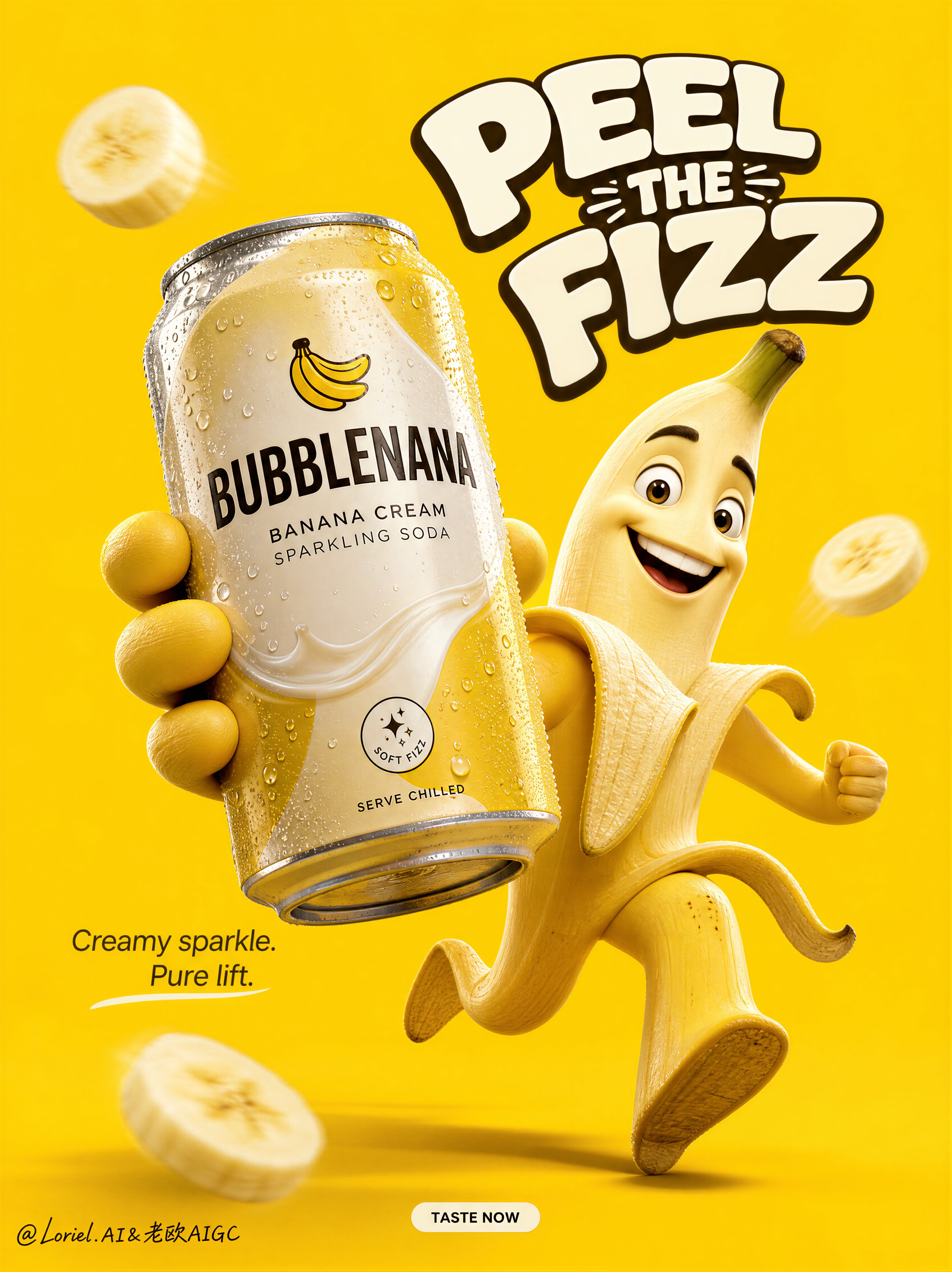
Create a Cannes-level flagship advertising poster for an original soft drink brand named BUBBLENANA, featuring the hero product Banana Cream Sparkling Soda. Build the image with refined Orbit motion and clean Transit reduction, creating a bold, globally polished FMCG launch key visual.
Core composition:
Use a vertical poster with a seamless, fully saturated banana-yellow background, pure and uninterrupted. Keep the environment completely minimal so the product, mascot, and headline dominate with absolute clarity.
Hero structure:
At center-right, place a premium 3D anthropomorphic banana character in a dynamic forward-running pose, full of joyful momentum and clean silhouette appeal. The peel opens naturally into limbs, with believable volume and refined texture. The face should feel expressive, charming, and globally brandable, with premium character realism rather than a childish cartoon look.
Product dominance:
At center-left foreground, place one oversized hyper-realistic aluminum can of BUBBLENANA Banana Cream Sparkling Soda, held forward toward the camera by the banana mascot. The can must sit slightly closer to the viewer than the character, creating strong depth and clear commercial dominance. It should feel ice-cold, highly detailed, and premium, with crisp condensation droplets, elegant metallic reflections, and clean modern packaging hierarchy.
Orbit structure:
Use the composition to create a strong visual loop:
curved headline -> mascot face -> presenting arm -> hero can -> lower body stride -> floating banana slices -> back up into the headline.
Reinforce the orbit with the can tilt, the leg motion, the arc of the title, and the placement of a few restrained banana slices. The eye should always return to the can as the core brand anchor.
Packaging direction:
Design the can with a premium, globally publishable identity:
BUBBLENANA
BANANA CREAM
SPARKLING SODA
Add only very restrained supporting details such as:
“soft fizz”
“serve chilled”
Keep the front-of-pack clean, elegant, and easy to read. Avoid noisy claims.
Typography system:
At the upper center-right, place one large original curved headline in bold custom rounded display typography:
“PEEL
THE
FIZZ”
The headline should feel playful but polished, with premium spacing and clean outline control. Add one short supporting line in smaller refined type near the can:
“Creamy sparkle. Pure lift.”
Keep typography minimal and internationally styled.
Transit reduction:
Remove all unnecessary copy, long descriptive text, and excessive social-style details. Keep only the essential brand-building elements: logo, headline, hero can, mascot, one short support line, and a small CTA.
At the bottom center, place a tiny clean CTA capsule:
“TASTE NOW”
Nothing else should compete with the hero product.
Floating elements:
Use only 2-3 softly motion-blurred banana slices, placed sparingly to support the sense of movement and flavor. Keep them subtle and secondary.
Lighting and color:
Use bright premium studio lighting with crisp highlights on the can, soft sculpted shadows under the mascot, and strong subject separation against the yellow field. Keep the palette tightly controlled around banana yellow, creamy off-white, metallic silver, and minimal deep accent color on the packaging.
Visual style:
Ultra-realistic commercial product rendering, premium 3D mascot realism, believable banana texture, realistic can condensation, clean packaging detail, flagship FMCG campaign quality, strong hierarchy, no clutter, no cheap retail-poster feel.
Mood:
Sunny, fizzy, playful, craveable, globally branded, high-energy, premium, instantly memorable.
Negative prompt:
cheap flyer design, cluttered composition, unreadable packaging, childish cartoon mascot, distorted limbs, awkward hands, flat lighting, muddy yellow background, too many floating slices, excessive copy, low-end convenience-store ad aesthetic, plastic-looking banana texture