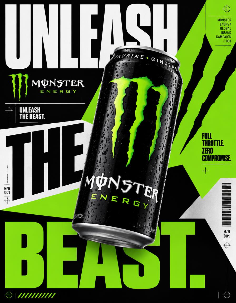
RED BULL — “UNLEASH THE VOLTAGE”
NEO-BRUTALIST INDUSTRIAL CHAOS CAMPAIGN
4:5 vertical advertising poster, ultra-high resolution, 8K-quality detail, premium global FMCG campaign, agency-level graphic design, photorealistic commercial product photography fused with experimental neo-brutalist editorial design.
CORE CREATIVE IDEA:
Transform Red Bull’s recognizable energy drink identity into an aggressive neo-brutalist graphic composition. The visual impact must come from typography, geometric color fields, sharp edges, extreme scale contrasts, and product photography—not from a decorative environment or cinematic background. The poster itself is the design system.
VISUAL SYSTEM:
Use an intentional, flat graphic composition built from oversized cobalt-blue panels, signal-red diagonal shapes, industrial-black blocks, crisp white fields, and selective yellow accents. Every shape must serve a clear compositional purpose. Use asymmetric divisions, overlapping rectangular planes, abrupt geometric transitions, visible alignment grids, registration marks, thin technical rules, measurement ticks, and restrained industrial annotations. The result must feel like experimental Swiss editorial design colliding with contemporary sports advertising.
BACKGROUND AND COMPOSITION:
NO CONVENTIONAL BACKGROUND. NO INDUSTRIAL WAREHOUSE. NO CONCRETE WALLS. NO DARK CINEMATIC ENVIRONMENT. Build the entire canvas from bold, flat, interlocking geometric color fields. Create a strong diagonal blue panel across the upper portion, an expansive white typographic field on the left, sharply defined black shapes through the center, and saturated red and blue geometric blocks toward the right. Introduce yellow as a deliberate accent rather than a dominant background. Maintain clean edges, intentional overlaps, and a sophisticated graphic grid. No gradients or atmospheric scenery.
HERO PRODUCT:
One oversized, photorealistic Red Bull Energy Drink can positioned centrally, slightly toward the right, tilted at a controlled diagonal. The can should occupy approximately 55–65% of the poster height and visually overlap the surrounding typography and geometric panels. Preserve authentic slim aluminum proportions, silver body, blue packaging sections, original red-and-yellow twin-bull emblem, Red Bull wordmark, and recognizable label layout. Render realistic aluminum reflections, fine condensation droplets, crisp edges, accurate perspective, and physically believable highlights. The can must remain the unmistakable focal point.
TYPOGRAPHY SYSTEM:
Use extremely oversized, extra-bold condensed sans-serif typography, comparable to premium sports-editorial display lettering. The headline must become a structural element of the poster.
Primary headline: “UNLEASH THE VOLTAGE.”
Split the headline into oversized typographic fragments across the left, center, and lower portions of the composition. Allow deliberate edge cropping and controlled overlap behind the can. Use white lettering on black or blue panels and black lettering on white fields. Keep the lettering exceptionally bold, tightly spaced, and sharply aligned. The headline should feel monumental, not like ordinary centered advertising copy.
Secondary copy:
“GIVES YOU WIIINGS.®”
“RED BULL ENERGY DRINK”
“MORE ENERGY. MORE FOCUS.”
Use restrained microtypography for technical labels, small numeric identifiers, alignment markers, and editorial annotations. Ensure all important text remains readable and correctly spelled.
BRAND INTEGRITY:
Preserve Red Bull’s recognizable corporate identity and original can design. Keep the twin-bull emblem and yellow sun accurate in appearance. Do not recolor, distort, reinterpret, or replace the official logo. Use the brand’s blue, red, yellow, black, and white palette as the foundation of the surrounding graphic system. No invented sub-brand or altered packaging.
GRAPHIC DETAILS:
Integrate precise grid intersections, thin white or black rules, tiny registration crosses, geometric number panels, barcode-like linear graphics, diagonal stripes, and sparse technical markings. Use a restrained amount of print grain and subtle surface texture within selected graphic areas. Keep all graphic details subordinate to the product and headline. Every element must appear intentionally art-directed.
PRODUCT LIGHTING AND PHOTOGRAPHY:
High-end studio product photography with controlled frontal illumination, narrow specular highlights, crisp silver reflections, realistic condensation, and a subtle contact shadow. Maintain strong separation between the physical can and the flat graphic elements. Premium commercial sharpness, realistic materials, accurate proportions, clean reflections, and natural product depth. The product should look photographed, not illustrated or cheaply rendered in 3D.
VISUAL HIERARCHY:
1. Oversized Red Bull can.
2. Monumental “UNLEASH THE VOLTAGE.” typography.
3. Authentic Red Bull logo and packaging.
4. Geometric color blocks and technical graphics.
5. Supporting campaign copy and microtypography.
ART DIRECTION:
Neo-brutalist graphic design, Swiss editorial grid disruption, experimental typographic poster, bold FMCG advertising, flat geometric composition, high-contrast corporate color blocking, premium commercial product photography, deliberate asymmetry, sharp visual hierarchy, and controlled graphic chaos.
NEGATIVE CONSTRAINTS:
No warehouse, no factory, no concrete architecture, no industrial scenery, no atmospheric background, no smoke, no sparks, no lightning effects, no floating debris, no random 3D shapes, no decorative gradients, no excessive grunge, no generic futuristic interface, no cluttered collage, no illegible headline, no incorrect branding, no duplicate cans, no distorted packaging, no fake logos, no watermarks.
FINAL RESULT:
A striking, print-ready neo-brutalist Red Bull advertising poster in which the graphic design is the environment. Bold, precise, visually disruptive, commercially polished, product-accurate, and instantly recognizable as a premium energy drink campaign.