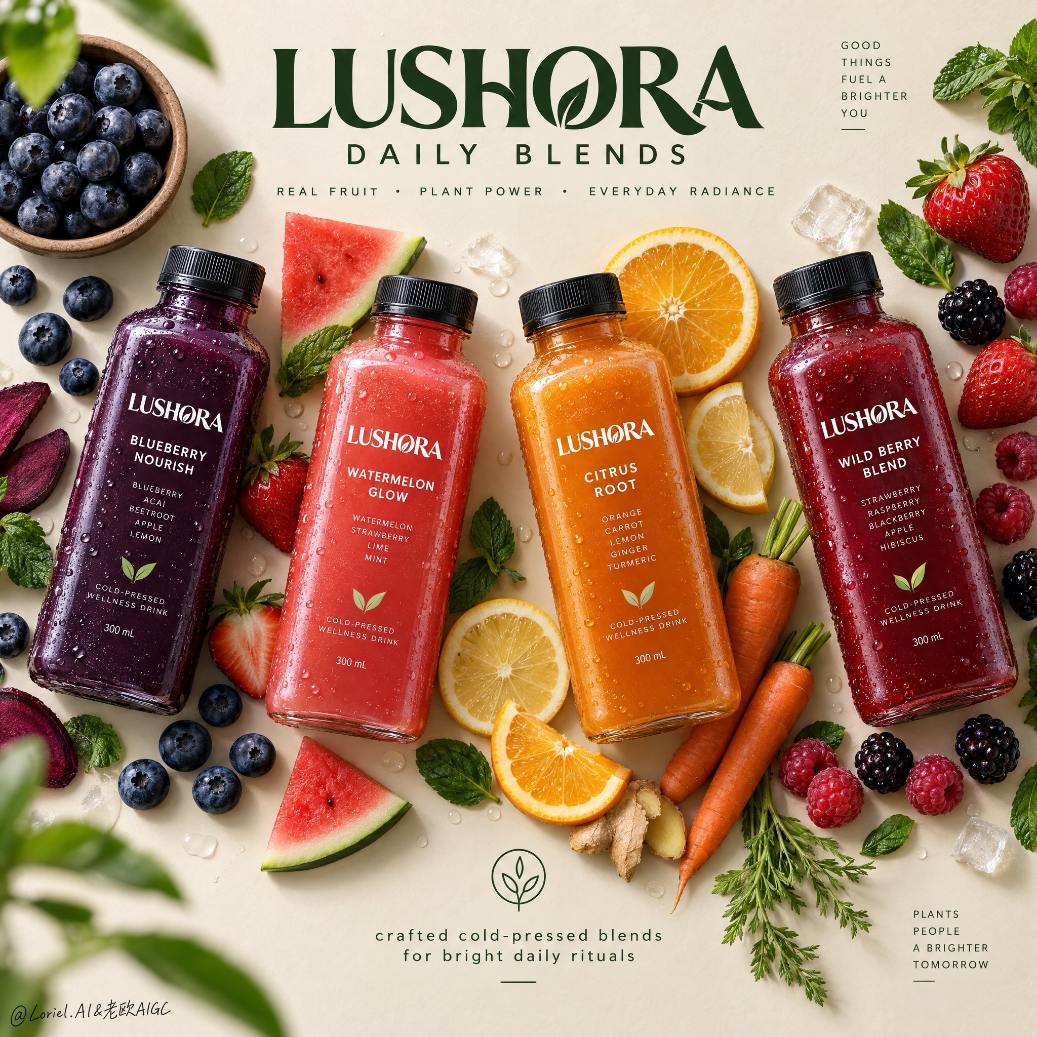
Create a Cannes-level top-down commercial poster for a fictional overseas cold-pressed wellness drink brand, "LUSHORA". Design a clean premium flat-lay on a warm matte oat-cream background, with four hyper-real chilled square bottles arranged in a refined diagonal rhythm across the frame. Fuse premium grocery advertising, editorial food styling, and contemporary exhibition-poster discipline. Keep the bottles as the absolute visual heroes, while fruit, vegetable, and leaf elements form a controlled perimeter frame that supports freshness, flavor identity, and spatial rhythm without clutter.
Use a straight overhead camera with precise poster geometry. Arrange four bottles with slight angle variation for elegance and motion: deep indigo-purple on the left, vivid coral-red left-center, glowing amber-orange right-center, and rich berry-crimson on the right. Preserve strong negative space at the upper center for the master brand mark and at the lower center for a minimal information lockup. The layout should feel balanced, crisp, modern, and campaign-ready.
Each bottle must feel tactile, cold, and commercially believable: thick clear PET or glass walls, realistic cap threading, matte black caps, micro-condensation, varied droplets, visible liquid density, subtle refraction, and sharp premium labels. The labels must read exactly "LUSHORA". Flavor lineup: "BLUEBERRY NOURISH", "WATERMELON GLOW", "CITRUS ROOT", and "WILD BERRY BLEND". The packaging should look globally branded, elegant, healthy, shelf-ready, with consistent hierarchy and clear typography.
Build a flavor halo with highly realistic ingredients placed with curatorial restraint: blueberries in a small natural bowl, loose berries, strawberries with leafy tops, sliced oranges, lemon rounds, raspberries, blackberries, mint leaves, and a few carrot elements for the citrus-root bottle. Keep ingredients visually grouped near their corresponding bottle without messy clusters. Add a few sliced and whole pieces for contrast. Some leaves and berries may sit near the edges as subtle framing accents, with one or two elements softly defocused for shallow depth, while the bottles stay perfectly crisp.
Lighting should be soft premium studio daylight from the upper left, with clean shadow falloff and gentle grounding beneath every bottle and ingredient. Use a controlled palette: 45% warm oat, cream, and sand neutrals; 35% vivid fruit colors from indigo, coral, amber, and crimson liquids; 20% botanical greens and fresh citrus highlights. Increase local contrast on bottle shoulders, droplets, fruit flesh, citrus translucency, berry skins, and mint veins so the image feels bright, tactile, and luxurious. Avoid dull greys, muddy shadows, and heavy black patches.
Materials must read with exquisite clarity: cold slick bottle surfaces, clean label print, soft matte caps, translucent citrus pulp, juicy strawberry flesh, powdery blueberry bloom, glossy berry skins, fresh mint veining, and slightly fibrous carrot texture. The finish should feel like premium health-beverage campaign art: minimal but abundant, bright but controlled, natural but highly designed, with freshness, wellness, appetite appeal, and modern retail sophistication.
Typography must be newly invented and art directed into the composition. At the upper center, place a bold premium custom logotype: "LUSHORA DAILY BLENDS". Beneath it, in smaller clean sans serif: "REAL FRUIT • PLANT POWER • EVERYDAY RADIANCE". At the lower center, add a minimal lockup with a small clean icon and the line "crafted cold-pressed blends for bright daily rituals". Use deep botanical green typography so it feels calm, premium, and naturally integrated with the ingredients. Keep all type elegant, readable, and clear of product labels.
The final image should unify emotional freshness, material richness, and graphic restraint into an international design-poster campaign. Maintain exact four-bottle hierarchy, coherent scale, realistic ingredient-to-flavor logic, clean spacing, crisp labels, premium advertising realism, and top-tier visual discipline. Avoid extra bottles, duplicated fruit, warped packaging, unreadable text, sloppy garnish clutter, broken bottle perspective, muddy background, cheap typography, excessive decorative particles, weak hierarchy, dead black shadows, or drift away from premium fresh wellness beverage advertising.