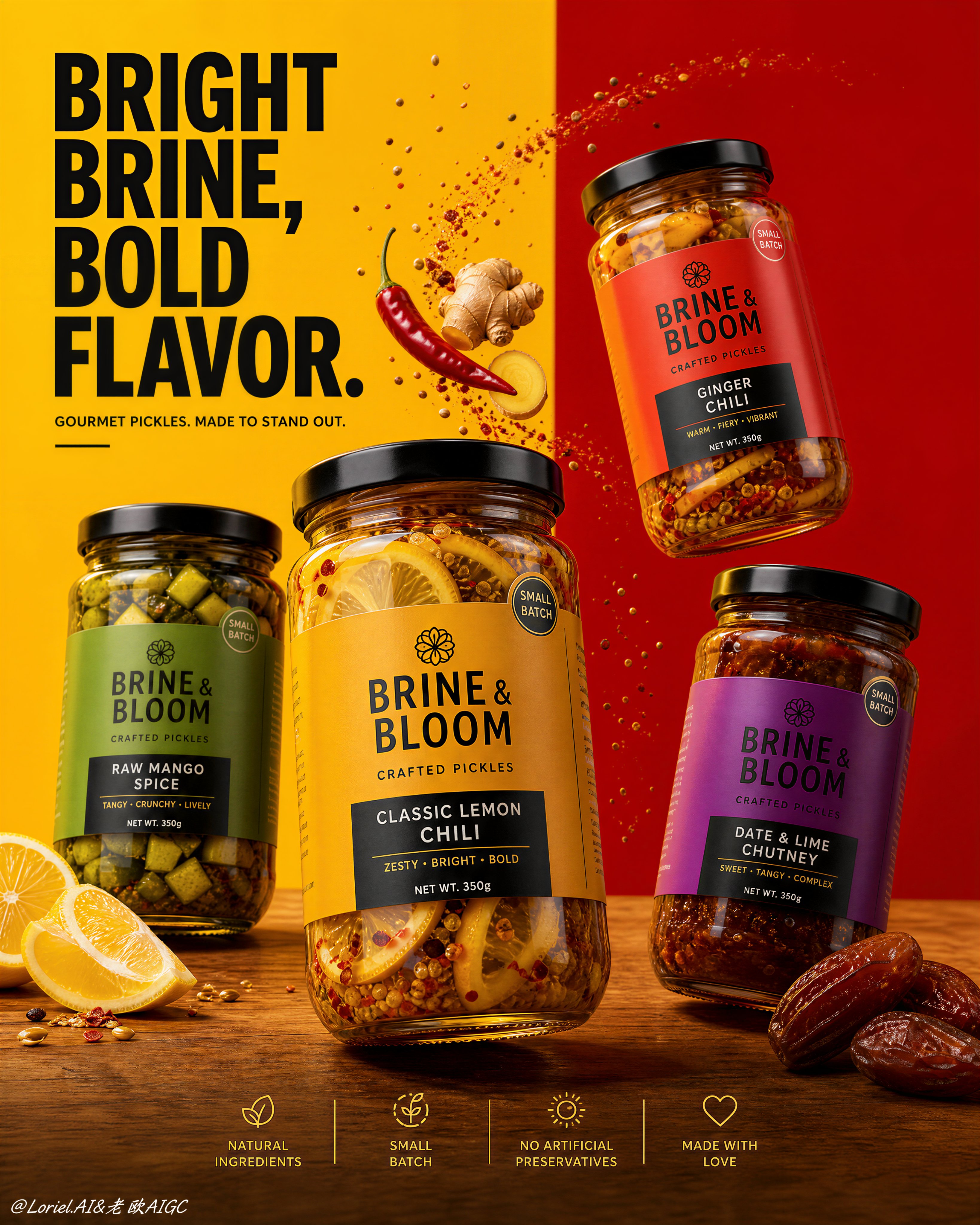
Create a flagship commercial advertising poster for a gourmet pickle brand named "BRINE & BLOOM", combining Orbit energy with Transit restraint. Use an ultra-realistic product photography style, not illustration, not 3D render. The poster must feature four premium glass pickle jars as the absolute visual heroes, displayed in a dynamic but controlled multi-SKU arrangement over a warm wooden tabletop, against a bold split background of rich turmeric yellow and saturated chili red. 
Style lock: high-end FMCG food advertising, Cannes-level art direction, clean premium supermarket hero image, sharp packaging realism, youthful but disciplined, bold shelf impact with minimal clutter.
Core composition: keep a strong graphic structure with a large clean headline block in the upper left, four jars arranged across the center in a floating-and-grounded composition with varied tilt angles, and a very minimal icon strip at the bottom. One hero jar should dominate slightly in scale and placement, while the other three support it in a balanced diagonal rhythm. Preserve strong negative space around the products so the layout feels premium and breathable rather than busy.
Orbit logic: introduce subtle directional motion through a few carefully placed ingredient elements and tiny spice particles that arc inward toward the hero jar, creating visual flow without visual noise. The motion should feel elegant and intentional, not explosive. Use ingredient placement to guide the eye across the four SKUs in a smooth premium path.
Transit logic: reduce all non-essential information, simplify the typography, minimize the number of props, and keep the layout clean and architectural. The products must remain dominant at all times. Avoid a crowded retail-flyer feeling. Let the poster feel bold through scale, contrast, and clarity rather than decorative excess.
Lighting: bright controlled studio lighting with crisp reflections on the glass jars and black lids, rich translucency in the brine, warm highlights that enhance texture and freshness, soft anchored shadows, highly polished commercial realism, no muddy contrast.
Materials and food realism: transparent glass with realistic thickness, glossy oily pickle surfaces, visible chili flakes, mustard seeds, lemon flesh, mango cubes, ginger slices, date textures, premium printed labels, matte-black lids, tactile wooden grain. Ingredient props should be few but highly photogenic: one sliced lemon, one chili, one ginger root, one date cluster, and a restrained scattering of spice particles.
Typography and layout: use original text only, never copy any existing wording. Place a bold premium headline in the upper-left area, such as "BRIGHT BRINE, BOLD FLAVOR." Add one short supporting line only. The bottom icon strip should contain only three or four concise feature points. Typography must be modern, bold, and secondary to the products.
Color strategy: vivid yellow and red background fields, warm brown wood, strong black lids, and distinct label color identities for each jar. Maintain high contrast, clear hierarchy, and a polished premium food-ad palette.
Mood: modern household favorite elevated into an international flagship campaign, flavorful, bright, confident, clean, premium, instantly legible.
Negative prompt: cluttered layout, too many props, weak product hierarchy, cheap flyer aesthetic, fake packaging, blurry labels, distorted jars, duplicated ingredients, flat lighting, muddy colors, excessive text, messy particles, cartoon look, illustration style, CGI feel, product losing dominance.