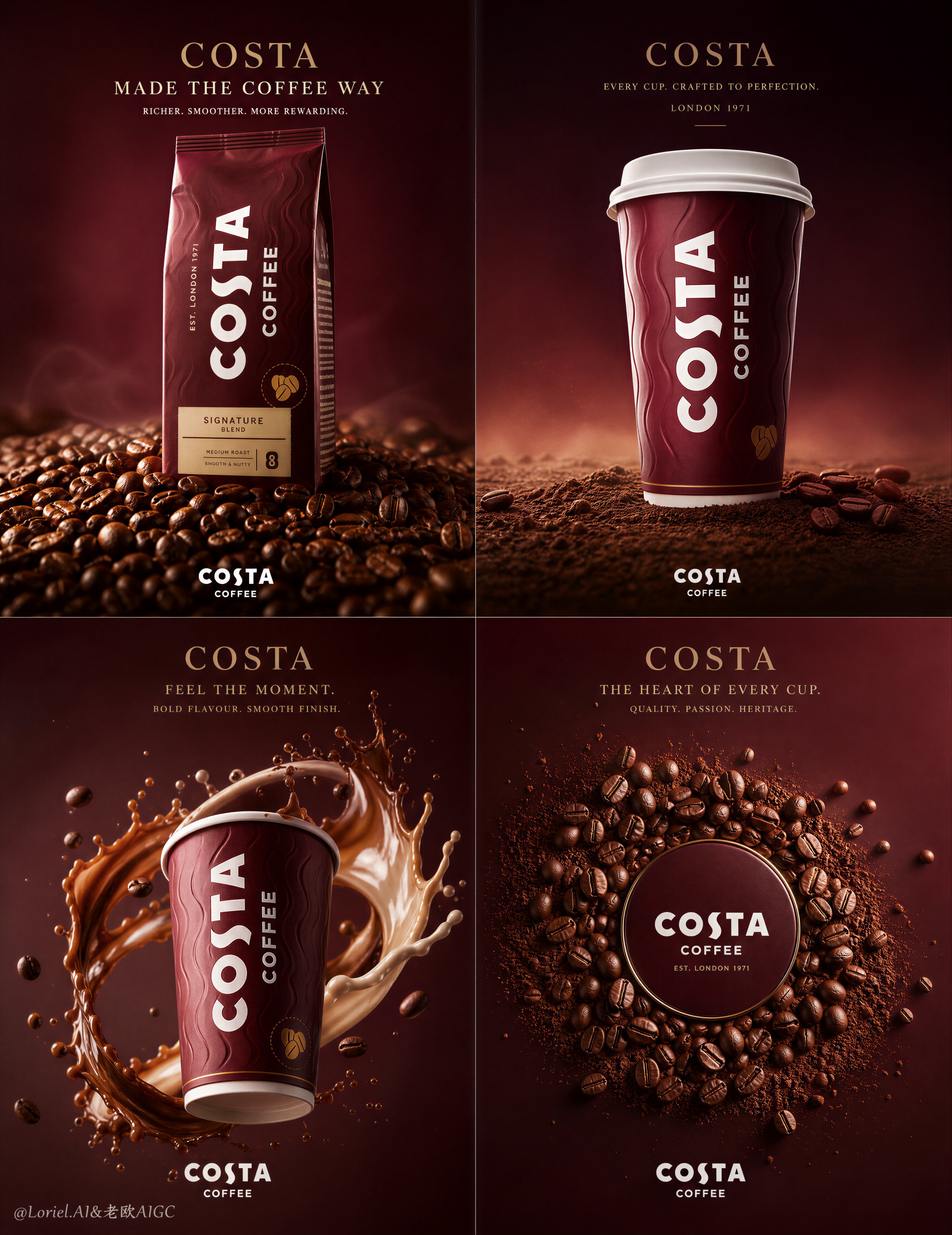
Create an ultra-premium commercial poster for the COSTA series in a strict 2x2 four-panel grid layout, designed like a world-class international coffee campaign. The entire artwork must preserve one unified luxury brand universe while presenting the product in four different visual states. Each quadrant must feel distinct, complete, and highly memorable, yet clearly belong to the same premium system. The core visual language is: product-dominant composition, refined burgundy coffee-brand tonality, hyper-real materials, elegant commercial lighting, minimal high-end background atmosphere, and carefully controlled English typography. This version must combine the strongest core direction with a refined same-skeleton enhancement: keep the original four-state structure, but make every panel feel more iconic, more spacious, more premium, and more visually breathable. The background in every panel must become emptier, cleaner, and more elevated, with more negative space, smoother tonal transitions, and fewer decorative distractions, so that the products, coffee beans, and coffee-liquid structures feel more sculptural and dominant.
Core layout:
Use a rigid 2x2 four-panel composition with premium spacing, clean borders, strong rhythm, and a refined editorial-commercial balance. Each panel represents a different state of the COSTA series while remaining inside one consistent visual system:
1. packaged coffee product hero shot,
2. takeaway cup hero shot,
3. dynamic liquid interaction shot,
4. coffee-bean and product-material composition shot.
All four panels must share the same brand atmosphere, color logic, lighting discipline, and typographic restraint. The overall poster should feel like a flagship campaign board from a global coffee brand.
Milk Cloud Orbit + Cream Halo Transit direction:
Push the strongest established qualities further: make the products more dominant, the coffee materials more desirable, the lighting more luxurious, and the overall composition more memorable. Keep the four-panel skeleton unchanged, but refine and replace certain supporting visual relationships so the campaign feels more elevated and less literal. The backgrounds must become more open and premium, with greater negative space, fewer unnecessary fillers, and more elegant air around the subjects. The coffee beans, grounds, and liquid should no longer feel like full-frame fillers; instead, they should be composed as highly intentional sculptural companions to the products. The result should feel calmer, richer, more graphic, and more brand-expensive.
Panel 1, packaging state:
Feature a hyper-realistic COSTA packaged coffee product standing vertically as the absolute center hero. Surround it with roasted coffee beans, but do not let the beans completely flatten or overcrowd the frame. Use a more intentional composition where the package is embedded in a carefully art-directed field of beans, with some areas denser and other areas opened up to allow breathing space and luxury negative space. The beans must feel glossy, warm, tactile, and photography-grade, with crisp cracks, subtle oil sheen, and varied roasted tones. The package must be extremely sharp and brand-dominant, with premium material realism, realistic folds, subtle print texture, and accurate packaging color. The upper background should remain more open, with elegant English headline typography placed into clean space rather than fighting dense texture.
Panel 2, cup state:
Feature a COSTA takeaway cup as a monumental sculptural icon, centered with calm authority on a restrained coffee-ground or bean-based terrain. The cup must feel tall, clean, premium, and irresistible, with accurate lid form, refined paper texture, correct branding, and subtle tactile shadowing. Replace any crowded surrounding composition with a more spacious, elevated atmosphere: the background should open into smooth burgundy-to-espresso gradients, with faint depth haze and only a few restrained foreground or edge elements if necessary. The terrain beneath the cup should feel intentional and controlled, not oversized. Keep the cup as the unmistakable focal point, surrounded by elegant emptiness that increases its luxury presence.
Panel 3, liquid state:
Feature the COSTA takeaway cup in a dynamic suspended composition with impeccably simulated coffee liquid and milk or cream splash forms. This panel should remain the most energetic of the four, but the liquid behavior must be cleaner, more sculptural, and more premium. The splash should wrap around or arc near the cup in a controlled, elegant way, with perfect surface tension, realistic viscosity, fine droplets, and appetizing motion. Do not let the liquid fill the entire frame. Leave meaningful negative space around the product and splash so the motion feels more expensive and editorial. The cup must stay central, sharp, and dominant, with the liquid enhancing it rather than competing with it.
Panel 4, bean composition state:
Create a premium composition based on roasted coffee beans and product-related coffee material logic, but refine it into a more sculptural and elevated brand closure panel. Instead of making the entire frame densely filled, use a more controlled arrangement where coffee beans cluster in a carefully shaped central field, while the surrounding background remains open, smooth, and luxurious. Integrate coffee beans, subtle coffee grounds, and possibly a restrained product-related form or clean central negative-space emblem logic that feels iconic and brand-intelligent. The bean composition must feel crisp, appetizing, premium, and tactile, with perfect scatter control and elegant spatial balance. This panel should feel more like a high-end identity composition than a literal bean pile.
Product realism:
All COSTA products must be rendered with extreme realism and global-advertising fidelity. Packaging materials, paper cup texture, lid edges, print surfaces, reflections, and contact shadows must feel physically correct and premium. No cheap mockup feeling, no generic cup shapes, no plastic-looking surfaces. Every visible product element must feel like a top-tier campaign photograph translated into world-class image generation quality.
Coffee bean realism:
Render the coffee beans with obsessive detail: realistic roast variation, subtle oil sheen, sharp cracks, rich brown complexity, tactile pores, and appetizing surface depth. The bean compositions must feel intentional and art-directed rather than randomly scattered. Use density variation to create rhythm and focus. Let some areas feel concentrated and rich, and others open up into clean space, increasing visual sophistication.
Liquid realism:
The coffee liquid and milk or cream must be rendered with world-class physical realism: clean flowing edges, elegant arc logic, realistic thickness, subtle translucency, perfect splash behavior, and high-end appetizing detail. The motion must feel dynamic but controlled, sculptural rather than chaotic, and visually expensive rather than messy.
Background and atmosphere:
Make the background in every panel more minimal, more open, and more luxurious. Use elegant deep burgundy, wine-red coffee tones, dark mocha, and soft espresso gradients, but simplify the atmosphere so the product and materials have more room to breathe. The backgrounds should not feel empty in a cheap way; they should feel curated, refined, and premium, with smooth tonal transitions, faint cinematic haze, subtle micro-dust, and gentle depth separation. No clutter, no unnecessary props, no busy scenery, no excessive botanical distractions. More silence, more control, more luxury.
Lighting:
Use extremely refined soft commercial lighting with subtle cinematic polish. The lighting must be consistent across all four panels, revealing product contours, bean textures, packaging materials, cup surfaces, and liquid forms with smooth highlight falloff and elegant shadow depth. The light should feel warm, premium, and delicious, never harsh, never overexposed, never theatrical. It should make each object feel tactile and desirable while preserving the calm high-end atmosphere.
Typography and branding:
Use elegant English-only typography with a premium international campaign feel. Include a refined English main title and a short support line in the upper area, with restrained official-feeling COSTA brand placement. The typography must be art-directed, modern, spacious, and integrated into the composition. Avoid crude bold fonts, cheap commercial layout, or excessive copy. The text should feel elevated and minimal, using the empty background space intelligently.
Color direction:
Use a sophisticated palette built from deep burgundy, wine coffee red, roasted brown, dark mocha, espresso black-brown, creamy beige highlights, and subtle warm reflections. Keep the brand world rich and recognizable, but avoid overfilling the frame with color density. Let the empty background zones create balance and luxury.
Mood:
premium, rich, appetizing, sculptural, branded, calm, tactile, elegant, modern, luxurious, editorial, coffee-driven, refined, high-end
Rendering style:
ultra-premium COSTA coffee campaign, strict 2x2 four-panel poster, four product states, hyper-real packaging and takeaway cup, sculptural coffee bean compositions, premium clean coffee liquid simulation, more open luxury background atmosphere, refined English typography, soft cinematic commercial lighting, world-class food advertising aesthetic, 8k, collector-grade image quality
Negative prompt:
cheap packaging mockup, generic coffee cup, plastic-looking materials, muddy liquid splash, messy composition, overcrowded bean filler, noisy background, low-detail beans, weak product focus, flat lighting, ugly typography, random decorative props, cartoon coffee, exaggerated chaotic splash, cluttered poster, cramped layout, cheap brochure style