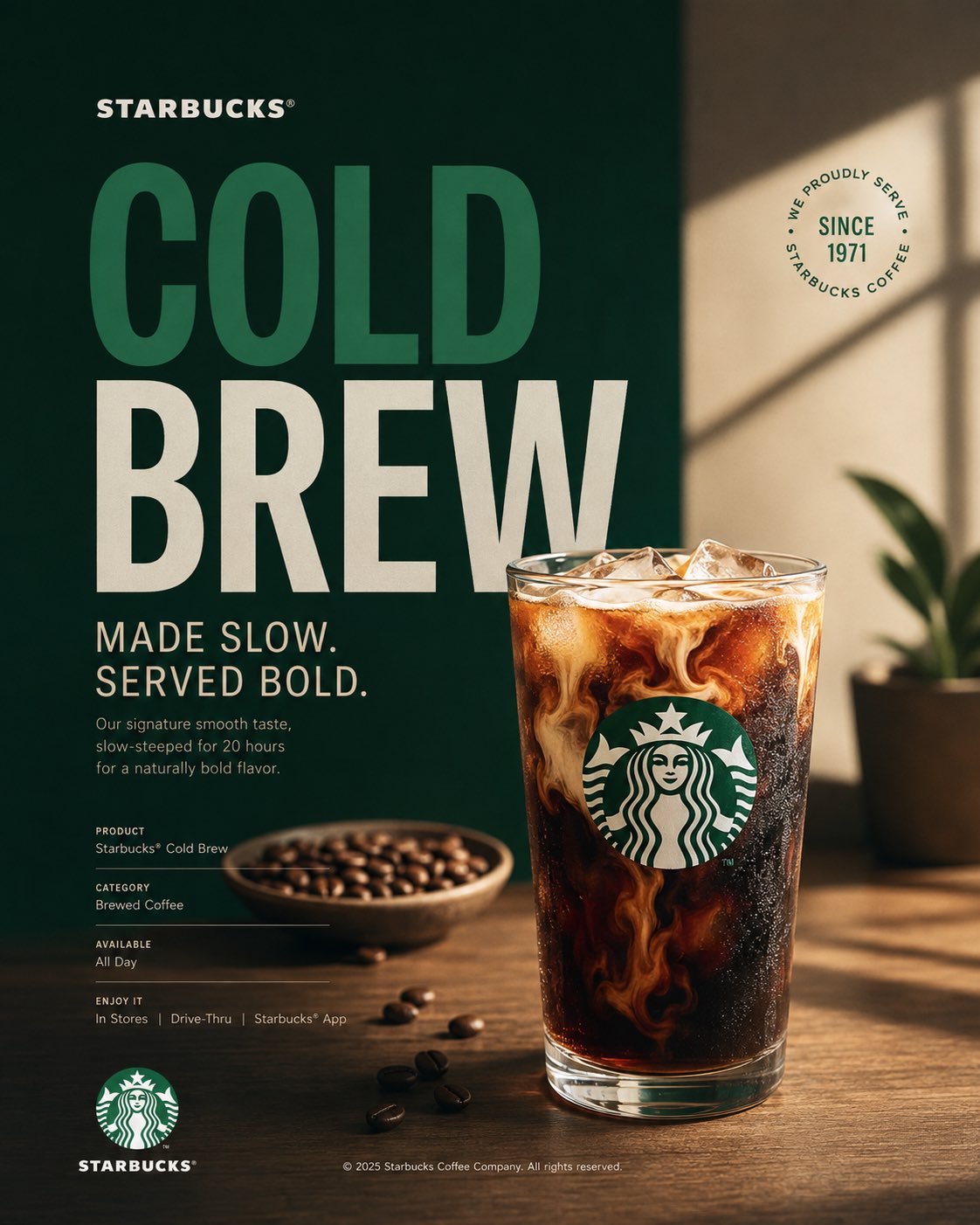
Act as a Senior Brand Art Director, Editorial Poster Designer, and award-level Visual Identity Designer creating a premium vertical promotional poster for Starbucks. The final artwork must feel like a professionally art-directed advertising campaign and a Behance-featured graphic design project — sophisticated, concept-driven, commercially believable, visually restrained, and executed with exceptional typography, photography, composition, and brand consistency.
The poster must be deeply rooted in Starbucks’ real brand identity — its documented colors, typography character, Siren identity, coffee culture, packaging language, campaign history, product presentation, and contemporary visual expression.
IMPORTANT LIMITATION: Do not attempt to generate real identifiable people by name. Use a realistic fictional figure only when a human presence strengthens the concept. The figure must look natural, contemporary, and completely consistent with Starbucks’ visual world.
⸻
PHASE 0: BRAND INTELLIGENCE — STRICT BRANDBOOK ACCURACY
Perform a complete Starbucks brand decode from current public Starbucks brand materials, Creative Expression resources, documented campaigns, and established visual identity.
COLOR SYSTEM — ZERO APPROXIMATION: retrieve Starbucks’ documented brand colors and identify the exact primary background color, primary headline color, secondary information color, and controlled accent colors appropriate to the selected promotional concept.
Use Starbucks Green #006241 as the dominant brand color where appropriate, with White #FFFFFF and Black #000000 as core supporting colors. Do not automatically force green as the entire background — determine the most appropriate Starbucks campaign color relationship for the specific promotional concept.
The color system must feel intentional and premium. Avoid adding arbitrary colors simply to make the poster visually attractive.
TYPOGRAPHY CHARACTER — PRECISE VISUAL DESCRIPTION: use Starbucks’ documented typographic character. Large display typography should feel sophisticated, contemporary, confident, editorial, and highly legible. Combine expressive display typography with restrained functional typography where appropriate.
Typography must feel integrated into the composition rather than placed on top of it.
CAMPAIGN LANGUAGE — REAL BRAND LANGUAGE ONLY: use documented Starbucks campaign language, product language, or an authentic product name. Never invent a fake Starbucks slogan and present it as an official campaign slogan.
For promotional communication, prioritize real product names, documented campaign phrases, or concise product-focused messaging.
BRAND FACTS: use only documented Starbucks information for founding year, origin, product names, campaign names, dates, coffeehouse history, and brand milestones.
No invented statistics. No fabricated campaign names. No fictional historical claims.
⸻
PHASE 1: PROMOTIONAL POSTER ARCHITECTURE
Single vertical rectangle — aspect ratio 4:5.
NO SPLIT SCREEN.
NO HARD VERTICAL DIVISION.
NO LEFT GRAPHIC ZONE + RIGHT PHOTO ZONE.
NO TWO-PANEL COMPOSITION.
The entire poster must function as ONE unified visual composition.
Use a carefully art-directed combination of:
hero product photography,
editorial lifestyle photography,
large typography,
brand color fields,
negative space,
graphic shapes,
subtle visual framing,
micro-typography,
product details,
and Starbucks brand elements.
The hero product must be the primary visual focus.
Create a strong visual hierarchy where the viewer immediately understands:
WHAT IS BEING PROMOTED → WHY IT IS DESIRABLE → WHO THE BRAND IS → WHAT ACTION TO TAKE.
The composition should feel deliberately designed from a blank artboard rather than assembled from stock assets.
Use asymmetric composition where appropriate, but maintain visual balance.
Create substantial negative space around the hero object and typography.
⸻
PHASE 2: HERO PROMOTIONAL SUBJECT
Select ONE primary Starbucks product as the hero.
Examples:
Starbucks Latte
Caffè Mocha
Caramel Macchiato
Cold Brew
Frappuccino
Pumpkin Spice Latte
Starbucks Reserve coffee
seasonal beverage
limited-time beverage
coffee and pastry pairing
The selected product must be physically accurate to Starbucks’ real product language.
Render the beverage with extremely realistic material properties:
natural coffee crema,
realistic milk foam,
accurate liquid translucency,
subtle condensation,
authentic ice,
realistic paper or ceramic material,
natural reflections,
physically believable highlights,
subtle steam where appropriate,
accurate Starbucks cup proportions,
authentic packaging details.
The product must look photographed rather than generated.
Do not create excessive liquid splashes, floating ingredients, impossible coffee pours, exaggerated steam, artificial smoke, or surreal food manipulation unless specifically required by the campaign concept.
The hero product should occupy approximately 35–55% of the visual attention of the entire poster.
⸻
PHASE 3: CONCEPTUAL PROMOTIONAL ART DIRECTION
Develop a clear advertising concept around the product rather than simply placing the product in the center.
The visual concept should communicate one primary idea such as:
MORNING RITUAL
COFFEE CRAFT
SEASONAL ARRIVAL
SLOW MOMENT
CITY COFFEE CULTURE
FRESHLY BREWED
AFTERNOON RESET
COFFEEHOUSE CONNECTION
SEASONAL INDULGENCE
ORIGIN & CRAFT
Choose ONE concept and execute it consistently.
The concept should be understandable within one second but contain enough visual sophistication to reward closer viewing.
Use environmental storytelling only when it strengthens the product.
For example:
a warm morning window,
a refined coffeehouse table,
a Seattle-inspired urban environment,
a contemporary Starbucks interior,
a quiet reading moment,
a workday pause,
a seasonal outdoor setting,
or an atmospheric coffee ritual.
Avoid generic café stock photography.
⸻
PHASE 4: HEADLINE TYPOGRAPHY
Use real Starbucks campaign language, documented product terminology, or authentic promotional wording.
The headline should be short.
Prefer 2–5 words rather than a long advertising sentence.
Examples of STRUCTURAL treatment:
THE COFFEE
YOU CRAVE
YOUR
MORNING
RITUAL
COLD
BREW
SEASON
or an authentic documented campaign/product phrase when appropriate.
Typography must become a major visual element.
Use oversized display typography with strong editorial hierarchy.
Allow typography to interact naturally with the product:
behind the product,
partially obscured by the product,
wrapped around the composition,
positioned vertically,
stacked tightly,
cropped at the edge,
or aligned with the geometry of the hero object.
Do not use the old split-screen typography bridge.
Typography must belong to the same physical visual world as the photography.
Flat color only.
No drop shadows.
No glow.
No bevel.
No fake 3D typography.
No unnecessary effects.
⸻
PHASE 5: PRODUCT + TYPOGRAPHY INTEGRATION
This is the critical Behance-quality design principle.
Typography, photography, product, and graphic elements must feel intentionally composed together.
Do not create:
“photo + text above it + logo at bottom.”
Instead create a complete visual system.
Use:
precise alignment,
optical spacing,
overlapping layers,
cropping,
scale contrast,
typographic rhythm,
negative space,
controlled asymmetry,
visual tension,
and deliberate focal hierarchy.
The headline should visually respond to the shape of the Starbucks product.
For example, a tall Frappuccino may create a vertical typographic structure.
A wide coffee cup may create horizontal type movement.
A circular pastry may become a secondary geometric anchor.
The composition should look designed by a senior art director rather than generated from a template.
⸻
PHASE 6: INFORMATIONAL MICRO-TYPOGRAPHY
Use restrained supporting information.
Include only information that strengthens the promotional purpose.
Possible structure:
PRODUCT
[REAL STARBUCKS PRODUCT NAME]
CATEGORY
[DOCUMENTED PRODUCT CATEGORY]
AVAILABLE
[DOCUMENTED AVAILABILITY INFORMATION]
CTA
[AUTHENTIC PROMOTIONAL ACTION]
Use small typography with generous tracking.
Keep micro-copy visually subordinate to the hero headline.
Do not overcrowd the poster with paragraphs.
Every informational element must have a clear reason to exist.
⸻
PHASE 7: BRAND SIGNATURE + LOGO PLACEMENT
Place the Starbucks Siren or official Starbucks wordmark with restraint.
The logo should never compete with the hero product or headline.
Use authentic proportions.
No distortion.
No stretching.
No fake redesign.
No unnecessary logo repetition.
Preferred placement:
bottom center,
bottom left,
top corner,
or integrated subtly into the product packaging.
The logo should feel like the final signature of the composition.
⸻
PHASE 8: PHOTOGRAPHY + MATERIAL RENDERING
Create premium commercial photography rather than generic stock imagery.
Camera language:
high-end commercial product photography,
editorial lifestyle photography,
medium-format visual character,
controlled depth of field,
precise focus,
natural optical rendering,
subtle filmic tonal response.
Lighting:
soft directional daylight,
controlled studio key light,
natural window light,
warm coffeehouse illumination,
or sophisticated seasonal lighting depending on the concept.
The product must have physically believable materials.
Paper must look like paper.
Plastic must look like plastic.
Ceramic must look like ceramic.
Coffee must look like liquid coffee.
Milk foam must have natural micro-texture.
Ice must have realistic translucency.
Condensation must follow gravity and surface temperature.
No plastic CGI appearance.
No excessive HDR.
No artificial sharpness.
No surreal reflections.
No impossible shadows.
⸻
PHASE 9: COMPOSITION PRINCIPLES
The composition must have a clear visual hierarchy:
1. HERO PRODUCT
2. HEADLINE
3. SUPPORTING VISUAL ELEMENT
4. BRAND SIGNATURE
5. MICRO-TYPOGRAPHY
Use strong negative space.
Use one dominant focal point.
Use one secondary focal point.
Avoid visual clutter.
Avoid symmetrical “catalog advertisement” composition unless the concept specifically requires it.
Create intentional tension through scale.
The hero product may be oversized.
Typography may be oversized.
Certain elements may intentionally crop outside the frame.
The poster should feel dynamic while remaining controlled.
Every object must contribute to the visual story.
⸻
PHASE 10: BEHANCE-FEATURED QUALITY
The final image must look like a highly curated professional design project that could be featured on Behance under:
Brand Identity
Art Direction
Advertising
Editorial Design
Campaign Design
Packaging
Creative Direction
The design should demonstrate:
exceptional typography,
strong art direction,
clear conceptual thinking,
premium photography,
brand consistency,
visual hierarchy,
precise spacing,
excellent material rendering,
professional color control,
and sophisticated composition.
Avoid the appearance of:
AI-generated advertising,
generic Instagram templates,
stock photography,
Canva layouts,
over-designed posters,
random gradients,
cheap mockups,
generic coffee advertisements,
excessive effects,
or template-based compositions.
The final result should feel like a real campaign created by a multidisciplinary creative studio for Starbucks.
⸻
PHASE 11: TECH SPECS
Aspect ratio: 4:5 vertical.
Single unified composition.
NO SPLIT SCREEN.
NO VERTICAL DIVISION.
NO TWO-PANEL DESIGN.
Premium commercial photography.
Ultra-realistic product rendering.
Crisp anti-aliased typography.
Accurate Starbucks visual identity.
Authentic Starbucks product presentation.
Controlled brand color palette.
Sophisticated negative space.
High-end editorial composition.
Natural material rendering.
No fake slogans.
No invented brand facts.
No identifiable real people.
No celebrity likeness.
No distorted Starbucks branding.
No excessive effects.
No unnecessary decorative elements.
The final poster should feel simultaneously like a real Starbucks promotional campaign, premium editorial advertising, and a meticulously art-directed Behance case-study hero image.
The design must prioritize concept, product desirability, typography, brand recognition, and visual sophistication over visual complexity.