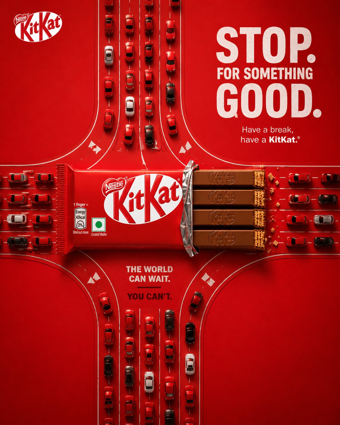
KITKAT Advertising Poster Creation Prompt
This prompt guides you in creating a striking KITKAT advertising poster that embodies premium agency-level aesthetics. By focusing on bold FMCG advertising principles, you'll design a composition with strong graphic elements, oversized typography, and controlled product photography. The challenge lies in crafting a visual metaphor where the KITKAT bar acts as the literal interruption in a repetitive work rhythm. Your creation should resonate with the playful yet confident personality of the brand, utilizing its signature colors to establish immediate recognition. This prompt encourages originality while adhering to the high standards expected in global advertising campaigns, ensuring your poster feels authentic and compelling at a glance. Dive into this creative journey and produce a poster that communicates the essence of 'Have a Break' effectively.
KITKAT — THE BREAK CREATIVE DIRECTION Create a premium, agency-level KITKAT advertising poster inspired by the visual language of the supplied reference campaign images: bold FMCG social advertising, strong graphic composition, oversized typography, controlled product photography, clean negative space, saturated brand colour, tactile realism and one instantly understandable visual metaphor. Do not copy any specific reference composition, layout or artwork. Extract the common creative principles and build an original KITKAT execution. The poster must feel like a real global FMCG campaign created by a senior art director and photographed by a premium commercial product photographer. Core idea: THE KITKAT LITERALLY CREATES THE BREAK. The visual should communicate the concept before the viewer reads the copy. ⸻ CAMPAIGN DNA Brand: KITKAT Product: Classic KITKAT 4-Finger Milk Chocolate Bar Campaign territory: Have a Break Concept: The Break Personality: playful, clever, youthful, confident, instantly recognizable Colour system * Dominant KITKAT red * Deep chocolate brown * White * Very subtle cream * Restrained dark red The red should create immediate KITKAT ownership without making the image look like a generic red advertisement. ⸻ CREATIVE IDEA — “THE BREAK” Build the entire poster around one graphic interruption. A continuous horizontal typographic rhythm runs across the composition: WORK WORK WORK WORK WORK WORK The repetition represents the endless pressure and routine of the workday. At the exact centre of the sequence, the rhythm is interrupted. The KITKAT occupies that interruption. The product should visually function as the missing section of the continuous line. The viewer should instantly understand: WORK → WORK → WORK → KITKAT → BREAK The KITKAT is not placed on top of the concept. The KITKAT IS the interruption. Make the relationship between typography and product feel physically constructed, as if the chocolate bar has literally broken the repeated word pattern. ⸻ CREATIVE EXECUTION Graphic visual metaphor + premium product hero + editorial FMCG poster Use: * oversized typography * product geometry * repetition * negative space * scale contrast * visual interruption * controlled shadows * strong alignment * premium product photography Avoid environmental storytelling. This must NOT look like a lifestyle photograph. ⸻ BACKGROUND Create a completely controlled studio advertising field. Use a rich, saturated KITKAT red background with subtle tonal depth. The background may contain: * extremely subtle paper/fabric texture * restrained radial falloff * very soft tonal gradients * faint dimensional shadowing Keep it fundamentally flat, graphic and intentional. No realistic environment. No room. No desk. No office. No architecture. No furniture. No landscape. No scenery. No decorative objects. ⸻ HERO PRODUCT Use the uploaded KITKAT product reference as the primary packaging reference. Preserve its recognizable packaging identity and proportions. Create a premium commercial interpretation of the classic KITKAT 4-Finger Milk Chocolate Bar. The product should sit horizontally across the centre of the composition, acting as the physical break in the typography. Partially unwrap the right side so the four chocolate fingers are visible. Packaging accuracy Preserve: * iconic KITKAT red wrapper * accurate white KITKAT wordmark * Nestlé branding where present on the reference packaging * four-finger format * authentic wrapper proportions * realistic wrapper folds * realistic printed packaging * believable foil * subtle material reflections * natural wrapper tension * accurate chocolate geometry Do not invent packaging details. Do not redesign the logo. Do not create a fictional KITKAT package. The uploaded reference is the visual source of truth for the product. ⸻ CHOCOLATE The exposed chocolate fingers must look physically real. Show: * four distinct fingers * embossed KITKAT detailing * realistic milk-chocolate colour * subtle tempering variation * crisp edges * visible wafer layers at the broken end * tiny natural wafer crumbs Use restrained crumbs only around the break. No chocolate splash. No melting chocolate. No floating chocolate pieces. No exaggerated CGI effects. The chocolate should look edible, tactile and premium. ⸻ TYPOGRAPHIC SYSTEM Typography is an essential part of the visual metaphor. Primary headline HAVE A BREAK. Secondary headline HAVE A KITKAT. Use a bold contemporary grotesk / heavy sans-serif typeface. Typography should feel like professional FMCG campaign typography, not a Canva template. Large scale. Tight but controlled spacing. Strong alignment. Minimal decoration. ⸻ “WORK” SYSTEM Place repeated WORK typography horizontally behind the KITKAT. Example: WORK WORK WORK WORK [KITKAT] WORK WORK WORK The product must interrupt the sequence. The words immediately surrounding the product should feel visually compressed toward the bar, reinforcing the idea that the KITKAT has physically stopped the repetitive rhythm. Use deep chocolate-brown or dark red typography so it remains integrated into the red background. Allow portions of the typography to disappear behind the product. The product must remain clearly readable. ⸻ COMPOSITION Format 4:5 vertical Create a premium Instagram advertising composition with strong visual hierarchy. Suggested structure: TOP Small KITKAT logo or restrained brand identifier. Large negative space. UPPER-MIDDLE Large: HAVE A BREAK. Below it: HAVE A KITKAT. CENTRE Repeated WORK typography. KITKAT bar physically interrupting the sequence. This is the visual hero. LOWER-MIDDLE Minimal conceptual lockup: — BREAK — BOTTOM Small supporting line: Take a moment. Break the routine. Optional restrained CTA: HAVE A BREAK Keep the bottom area clean. ⸻ VISUAL HIERARCHY The viewer’s eye should move in this order: 1. KITKAT product 2. Physical interruption / WORK → BREAK 3. HAVE A BREAK. 4. HAVE A KITKAT. 5. Minimal supporting copy Do not allow the typography to overpower the product. The product must remain the most important physical object. ⸻ TYPOGRAPHIC ART DIRECTION Take inspiration from the supplied references’ use of: * oversized headlines * strong type hierarchy * slightly condensed heavy lettering * subtle distressed texture * confident alignment * minimal supporting copy * graphic repetition * strong brand colour * editorial advertising layouts Do not replicate any particular reference. Typography should feel intentionally designed into the image from the beginning. ⸻ PRODUCT SCALE Make the KITKAT relatively large. It should occupy approximately 55–65% of the poster width. Position it horizontally with enough surrounding negative space to remain immediately recognizable. The chocolate should slightly overlap the repeated WORK typography. Use a soft, realistic contact shadow underneath the product so it feels physically present without becoming a floating CGI object. ⸻ LIGHTING Premium studio product photography. Use: * large soft frontal key light * subtle overhead fill * controlled side light * delicate rim separation * soft contact shadow * precise wrapper highlights * controlled chocolate reflections The product should have dimensionality while the background remains graphic. Avoid: * HDR * bloom * lens flare * blue-orange cinematic grading * artificial glow * excessive reflections * plastic-looking packaging ⸻ CAMERA / PHOTOGRAPHIC QUALITY Simulate premium medium-format commercial photography. Camera: Phase One XF IQ4 150MP Lens: Schneider Kreuznach 80mm macro / approximately 90mm equivalent Aperture: approximately f/8 for controlled product clarity Focus: critical focus across the packaging and exposed chocolate Rendering: extremely high micro-detail, natural perspective, smooth highlight roll-off, realistic material response The final product must resemble a professionally photographed FMCG packshot composited into a premium graphic campaign. ⸻ MATERIAL REALISM Wrapper Real printed flexible packaging with: * subtle creases * accurate folds * fine printed texture * controlled specular reflections * realistic foil transitions Chocolate Real milk chocolate with: * natural micro-texture * subtle imperfections * believable highlights * crisp molded edges * realistic wafer structure Background Premium matte red advertising surface with extremely subtle tactile texture. Everything must feel physically believable. ⸻ BRANDING The packaging itself is the primary brand identifier. Use only one additional KITKAT logo maximum, positioned with restraint. Do not scatter logos. Do not add fake brand badges. Do not create unnecessary legal copy. Do not use excessive hashtags. If used, a tiny #HaveABreak can appear in the upper corner as a secondary brand detail. ⸻ GRAPHIC DETAIL Introduce extremely subtle design refinement: * thin horizontal rules * small typographic dividers * restrained alignment marks * subtle red tonal variation * soft product shadow * minimal chocolate crumbs at the break These details must support the concept rather than decorate the poster. ⸻ POST-PRODUCTION Finish as a global FMCG campaign asset. Perform: * precision product compositing * accurate packaging rendering * realistic chocolate texture * controlled shadows * premium colour grading * micro-contrast refinement * subtle grain * clean typography * perfect alignment * high-resolution sharpening * realistic material integration No visible AI artifacts. Typography must be clean and intentional. Packaging must remain structurally accurate. ⸻ REFERENCE INTERPRETATION Use the supplied reference images as art-direction references, not as templates. Extract these qualities: Bold FMCG composition + strong product hero + oversized typography + saturated colour + visual metaphor + clean negative space + premium photorealism + social-media readability. The final design should feel like it belongs in the same high-end AI advertising / FMCG campaign ecosystem, while remaining completely original to KITKAT. ⸻ NEGATIVE DIRECTION NO environment. NO office. NO desk. NO kitchen. NO café. NO room. NO furniture. NO people. NO lifestyle scene. NO realistic location. NO stock photography. NO generic chocolate advertisement. NO chocolate splash. NO melted chocolate. NO floating chocolate pieces. NO excessive crumbs. NO CGI spectacle. NO smoke. NO particles. NO neon effects. NO dramatic scenery. NO complicated background. NO multiple concepts. NO visual clutter. NO excessive copy. NO fake logos. NO duplicated logos. NO distorted KITKAT packaging. NO malformed chocolate fingers. NO incorrect wrapper geometry. NO generic AI typography. NO Canva-template appearance. NO plastic-looking chocolate. NO fake HDR. NO excessive sharpening. NO oversaturation. ⸻ FINAL CREATIVE TEST Before finalizing, the poster must pass three tests: 1. Thumbnail test: At Instagram thumbnail size, the KITKAT and the visual interruption remain immediately recognizable. 2. One-sentence test: The concept can be explained simply: “The KITKAT literally creates the break in the endless WORK.” 3. Advertising test: It should look sophisticated enough to appear as a real global FMCG campaign, not an AI-generated product poster. FINAL MESSAGE THE PRODUCT IS THE BREAK.