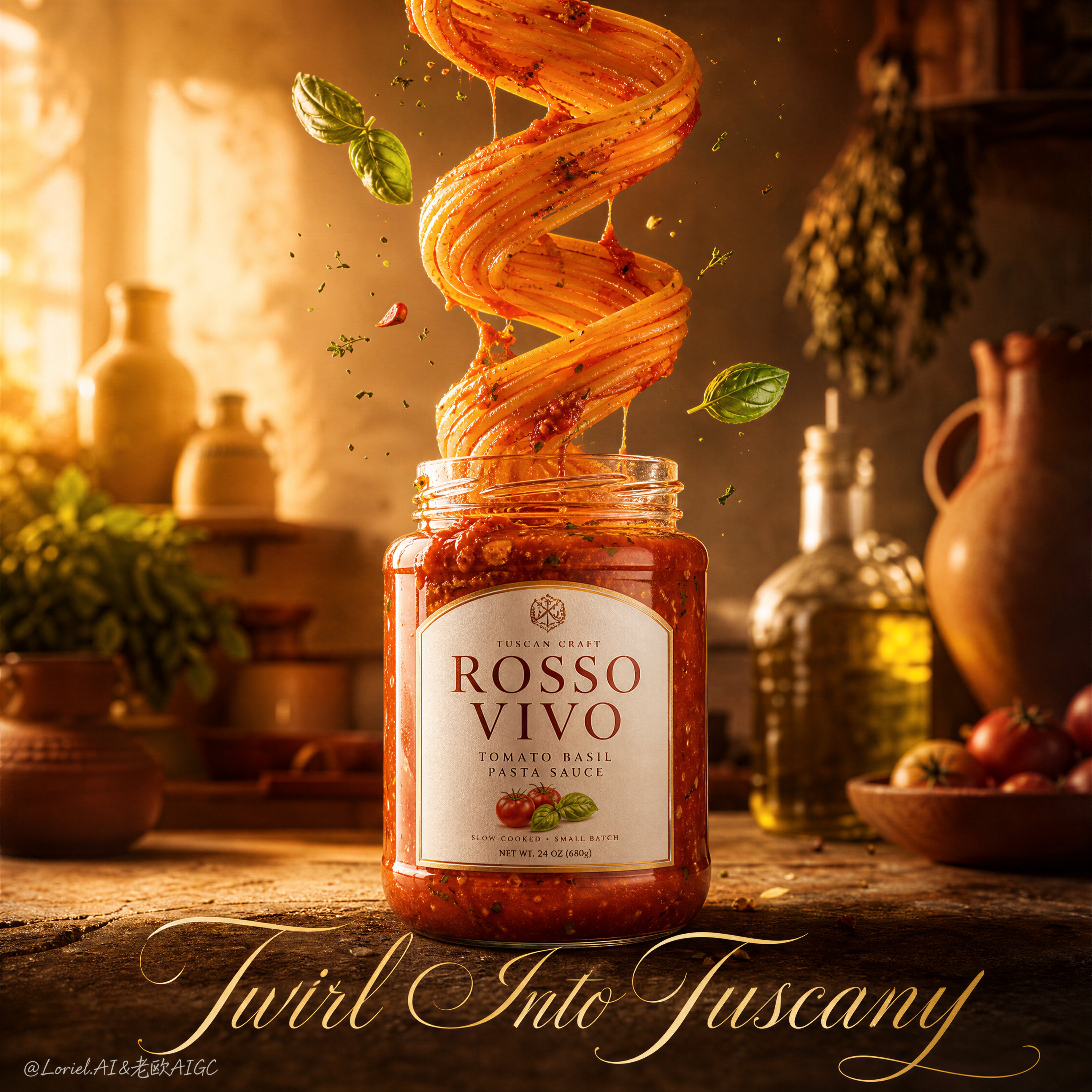
Create a Cannes-level ultra-premium food advertising poster for the fictional Italian pasta sauce brand ROSSO VIVO, merging Transit material precision with Port curatorial restraint while pushing the entire atmosphere toward a Tuscan kitchen at golden dusk. Strictly preserve the reference image’s core structure: one centered glass pasta-sauce jar anchored in the lower middle foreground, a dramatic vertical spaghetti helix rising directly out of the jar and twisting through the center of the frame, a restrained constellation of basil leaves and fine seasoning particles around the spiral, a softly blurred rustic kitchen behind, and one elegant oversized title line across the bottom. The jar must remain the absolute visual leader, while the spaghetti spiral acts as the sculptural emotional spectacle.
Core composition: use a vertical poster with disciplined negative space and strong central hierarchy. Place the pasta sauce jar large and centered in the lower middle. From the jar opening, a continuous mass of spaghetti rises in a graceful, controlled helix, forming two to three major loops before flowing upward out of frame. Reduce peripheral garnish clutter and keep only the most beautiful suspended accents: a few basil leaves, a restrained dusting of herb flecks, and minimal chili fragments. The image should feel cleaner, more gallery-like, and more premium than the reference, without losing energy. The rustic kitchen background must remain secondary and soft, acting as a warm contextual halo rather than a busy set.
Tuscan dusk atmosphere: shift the mood toward an elevated late-afternoon Tuscan kitchen. The background light should become softer, more golden, and more diffuse, as if the last honey-colored sunlight is entering through an unseen farmhouse window. Let the wall, hanging herbs, ceramic vessels, and oil bottles sink into a warm amber-beige glow with gentle falloff and subtle atmospheric haze. The scene should feel sun-warmed, artisanal, and quietly romantic, with the emotional tone of an Italian kitchen just before dinner service.
Hero product design: the jar must feel hyper-real, premium, and commercially perfect, with thick transparent glass, rich dense sauce visible through the body, believable label geometry, and refined original English branding such as “ROSSO VIVO” and “Tomato Basil Pasta Sauce.” The label should feel elegant, clean, and appetizing, not mass-market cheap. The sauce in the jar must show depth and integrity: slow-cooked tomato body, visible pulp, soft herb distribution, subtle olive-oil gloss, and a luxurious red-orange tonal range.
Transit material precision: push the tactile realism of every major element. The spaghetti strands must be individually legible, smooth, lightly glossy, and naturally tensioned where they compress into the spiral. The sauce must cling with convincing viscosity, gathering in thicker deposits along curves, stretching in thin glossy trails between strands, and displaying realistic tomato texture, soft pulp structure, herb flecks, and oil-rich sheen. The jar glass must show premium refraction, edge thickness, controlled reflection, and clean shadowing. The basil leaves should have slight curl, vein definition, and fresh moisture. The background oil bottles and ceramics should retain believable material behavior while staying soft and secondary.
Port restraint: simplify the image into a more curated advertising object. Eliminate unnecessary debris, reduce the number of floating accents, and let the composition breathe. Keep the spaghetti column and jar as the core visual dialogue. The background props must support the narrative of Tuscan craft without creating noise. The poster should feel closer to a luxury campaign or exhibition print than a crowded grocery ad.
Lighting: use warm cinematic food lighting with a soft frontal key and a golden side-back glow inspired by Tuscan sunset. The pasta loops should catch delicate highlights along their curves, the sauce should gleam richly without looking greasy, and the jar should hold luminous reflections with clean glass contour separation. The background should feel softly radiant and warm, while the hero product remains crisp and dimensional. Build appetite through gentle contrast, not harsh punch.
Typography and brand language: place one original elegant bottom title line such as “Twirl Into Tuscany” or “Where Sunset Meets Sauce” in a large refined script or editorial calligraphic style, integrated into the lower negative space. Use only English. Typography must feel boutique, graphic, and harmonious with the golden rustic palette.
Color direction: build the palette around 60% tomato red, warm terracotta, pasta gold, and sunset amber, 30% beige stone, muted olive, rustic cream, and aged plaster, and 10% deep herb shadow, olive-oil gold, and ceramic brown accents. The result must feel luxurious, warm, artisanal, and unmistakably Tuscan.
Rendering style: ultra-photoreal luxury food poster, centered pasta sauce jar hero, sculptural spaghetti helix, curated ingredient suspension, Tuscan golden-hour kitchen atmosphere, premium packaging design, Transit-grade material realism, Port-style visual restraint, world-class commercial finish, 8k detail.
Negative prompt: weak product hierarchy, cheap jar label, cluttered kitchen, tangled chaotic noodles, plastic-looking pasta, muddy red sauce, excessive flying debris, unreadable text, generic fonts, broken spaghetti anatomy, unrealistic sauce physics, flat lighting, noisy rustic props, low-end grocery poster style, oversaturated red grade, warped jar perspective, cartoon food rendering, messy composition