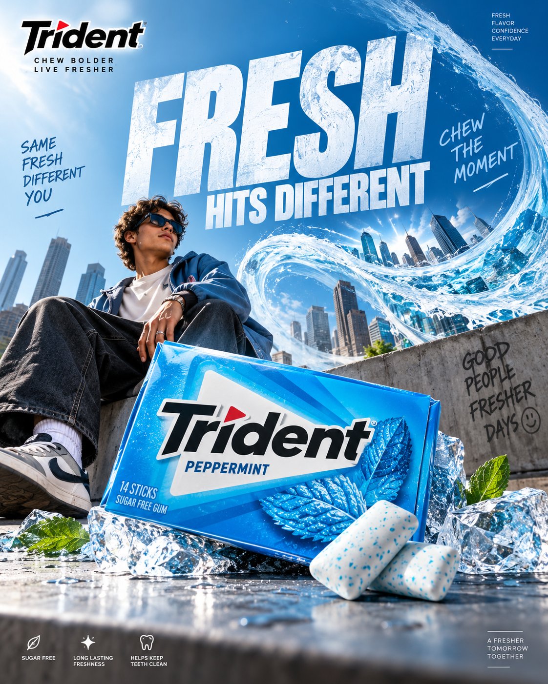
Premium Trident Gum Advertising Concept Prompt
This prompt invites you to craft a captivating advertisement for Trident chewing gum that transcends traditional food marketing. Your challenge is to create an eye-catching visual concept that transforms the simple act of chewing gum into a dynamic experience. The prompt emphasizes originality, visual surprises, and a strong metaphor to convey freshness, flavor, and connection. You'll need to maintain the integrity of Trident's branding and packaging while developing a visually imaginative environment that enhances the product's appeal. By focusing on premium photography, bold typography, and editorial design, the final output should resonate on social media, making it an irresistible scroll-stopper. Dive into this prompt and create a sophisticated, playful, and memorable advertisement that stands out in a crowded digital landscape.
TRIDENT. Act as a Social Media Art Director and Digital Collage Artist specializing in high-end FMCG advertising, premium confectionery campaigns, commercial product photography, bold editorial compositions, surreal visual storytelling, and culturally relevant Instagram content.
PHASE 1: CONCEPTUAL FRAMEWORK
Create a premium Trident chewing gum advertising poster built around one instantly understandable visual idea.
The advertisement should transform the simple act of chewing gum into a visually exciting experience. Think beyond conventional food advertising. Use a strong visual metaphor where freshness, flavor, confidence, connection, or an unexpected burst of sensation becomes a physical part of the environment.
The creative idea must be:
* Original
* Visually surprising
* Instantly understandable
* Social-media optimized
* Premium
* Playful but sophisticated
* Commercially believable
* Strong enough to work without excessive copy
Do not create a generic chewing-gum advertisement. Avoid random fruit explosions, generic mint leaves, floating products, excessive splashes, meaningless CGI, or stereotypical AI surrealism.
PHASE 2: PRODUCT & PACKAGING
Use the supplied Trident product packaging as the exact product reference.
Preserve:
* Exact package shape
* Brand logo
* Typography
* Colors
* Flavor name
* Product proportions
* Packaging graphics
* Wrapper details
* Material finish
* Product quantity where visible
The packaging must remain physically accurate and immediately recognizable.
Make the Trident pack the hero object of the composition.
If individual gum pieces are shown, maintain realistic proportions, wrapper construction, texture, folds, and material behavior.
Never redesign the packaging or invent product claims.
PHASE 3: CREATIVE VISUAL WORLD
Build an imaginative physical environment around the Trident product.
The environment should visually communicate the product benefit or flavor through a clever advertising metaphor.
Examples of creative territory:
* A wave of cool freshness physically transforming a city
* A mint-powered breeze bending an entire environment
* A giant flavor landscape emerging from one tiny piece of gum
* A frozen world breaking apart around the product
* A mundane social environment suddenly becoming vibrant
* Architectural forms shaped by the movement of fresh air
* An impossible miniature world contained inside the gum pack
The visual world should feel intentionally art-directed, not randomly surreal.
PHASE 4: BRAND COLOR & VISUAL IDENTITY
Use Trident’s established visual identity as the foundation.
Prioritize the actual product packaging as the primary color reference.
Where appropriate, incorporate Trident’s recognizable cool cyan/blue visual territory with white and dark neutral contrast, while adapting the palette to the specific flavor SKU.
Color should create:
* Freshness
* Energy
* Cleanliness
* Flavor recognition
* Strong product separation
Do not overload the artwork with unrelated colors.
PHASE 5: PRODUCT COMPOSITION
Create a sophisticated commercial product composition.
The Trident pack should occupy a strong hero position with realistic scale, perspective, and contact with the environment.
Use:
* Dramatic perspective
* Layered depth
* Foreground elements
* Midground product interaction
* Atmospheric background
* Intentional negative space
* Strong visual diagonals
* Controlled cropping
The product must feel physically present inside the scene.
Use realistic contact shadows, reflections, surface interaction, and material behavior.
PHASE 6: GRAPHIC DESIGN & COLLAGE
Combine premium FMCG photography with contemporary editorial graphic design.
Introduce graphic elements only when they strengthen the concept:
* Oversized typography
* Flavor labels
* Small technical information
* Editorial numbering
* Graphic lines
* Cropped shapes
* Repeated product details
* Subtle geometric elements
* Microcopy
Create visual tension between photographic realism and graphic design.
Avoid turning the poster into a template or a cluttered collage.
PHASE 7: TYPOGRAPHY
Create one short, memorable campaign headline connected directly to the visual idea.
Possible direction:
“CHEW THE MOMENT.”
“FRESH HITS DIFFERENT.”
“UNWRAP THE FRESH.”
“FRESHNESS, UNLEASHED.”
“FEEL THE FLAVOR.”
“MAKE ROOM FOR FRESH.”
Use bold, contemporary uppercase typography with strong editorial presence.
Typography should become part of the visual composition.
Allow oversized type to interact with the environment, overlap atmospheric elements, disappear behind objects, or extend beyond the frame where appropriate.
Maintain perfect spelling, clean letterforms, strong hierarchy, and commercial readability.
PHASE 8: BRAND INTELLIGENCE
Maintain Trident’s core communication territory:
* Freshness
* Flavor
* Everyday confidence
* Social connection
* Energy
* Approachability
* Contemporary culture
* Playful sophistication
Use the Trident logo correctly and prominently enough for immediate brand recognition without making the artwork feel like a packaging mockup.
Do not imitate a specific existing Trident campaign.
Create a completely original visual concept using the brand’s established identity.
PHASE 9: SOCIAL MEDIA ART DIRECTION
Format: 4:5 vertical Instagram poster.
Design specifically for mobile viewing.
The composition must:
* Stop the scroll immediately
* Communicate the idea within one second
* Make the product recognizable at thumbnail size
* Have one dominant focal point
* Maintain strong contrast
* Use clear visual hierarchy
* Feel premium when viewed full-screen
* Remain readable without zooming
The artwork should look equally strong as an Instagram post, paid social advertisement, and campaign carousel cover.
PHASE 10: COMMERCIAL FINISH
Create the finish of a world-class FMCG advertising campaign.
Use:
* Photorealistic product rendering
* Premium commercial lighting
* Realistic packaging materials
* High-detail textures
* Controlled reflections
* Accurate shadows
* Natural depth of field
* Sophisticated retouching
* Subtle atmospheric detail
* Sharp product edges
* Print-quality detail
Avoid:
* Generic AI aesthetics
* Plastic-looking packaging
* Warped logos
* Incorrect text
* Fake product geometry
* Duplicate products
* Random objects
* Excessive glow
* Excessive particles
* Cheap CGI
* Over-saturated colors
* Unnecessary visual clutter
* Stock-photo appearance
FINAL OUTPUT:
Create a world-class Trident chewing gum social advertisement where the product, advertising idea, environment, typography, color system, photography, and graphic design feel conceived as one unified campaign.
The final image should feel playful enough for social media, sophisticated enough for a global FMCG brand, and visually distinctive enough to be immediately recognizable in a crowded Instagram feed.
Premium FMCG advertising. Bold visual metaphor. Photorealistic product. Editorial graphic design. Fresh, energetic, culturally relevant, scroll-stopping.