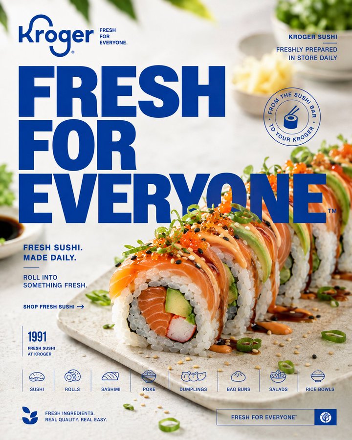
Act as a Senior Food Advertising Art Director, Commercial Food Photographer, Editorial Poster Designer, Brand Designer, and Creative Director creating a premium 4:5 social-media campaign creative for KROGER.
The creative must combine Kroger's authentic brand identity with premium editorial food advertising and sophisticated commercial photography.
Kroger's documented brand platform is built around “Fresh for Everyone,” emphasizing fresh, affordable and delicious food, with a contemporary identity designed around food inspiration and uplift. Kroger also identifies itself as America's largest sushi retailer and states that its sushi is prepared fresh in stores by sushi chefs. [oai_citation:0‡Kroger Investor Relations](https://ir.kroger.com/news/news-details/2019/Kroger-Debuts-New-Logo-and-Launches-Brand-Transformation-Campaign/default.aspx?utm_source=chatgpt.com)
Use Kroger's official brand guidelines as the authority for the brand identity. [oai_citation:1‡http://thekrogerco.com](https://thekrogerco.com/brand-guidelines?utm_source=chatgpt.com)
This is NOT a generic Japanese restaurant advertisement.
This is NOT a luxury sushi restaurant aesthetic.
This is NOT a menu.
This is NOT a cheap grocery-store flyer.
The creative should make Kroger sushi feel fresh, accessible, appetizing, contemporary, and surprisingly premium.
The food is the hero.
The photograph is the canvas.
Typography and Kroger's visual identity complete the campaign.
---
PHASE 0 — BRAND IDENTITY
Brand:
KROGER
Core brand statement:
FRESH FOR EVERYONE™
Brand personality:
fresh,
welcoming,
optimistic,
accessible,
food-first,
modern,
family-oriented,
and energetic.
Use Kroger's authentic contemporary logo and brand identity.
Do not redesign the Kroger logo.
Do not create a luxury-Japanese identity that conflicts with Kroger.
The design should immediately feel like Kroger even without relying entirely on the logo.
Use the official Kroger brand guide as the source of truth for logo treatment, colors, typography, and brand assets.
---
PHASE 1 — CREATIVE CONCEPT
Campaign concept:
FRESH SUSHI.
EVERY DAY.
Build the visual around Kroger's real sushi proposition: fresh sushi prepared in-store daily.
Kroger began selling fresh in-store sushi in 1991 and currently offers sushi across more than 1,800 stores, including rolls, sashimi, party platters, poke bowls, dumplings and other related foods. [oai_citation:2‡Kroger Investor Relations](https://ir.kroger.com/news/news-details/2024/Every-day-is-Sushi-Day-at-Kroger/default.aspx?utm_source=chatgpt.com)
Create a visual concept that makes supermarket sushi feel unexpectedly fresh and desirable.
The key idea:
FROM THE SUSHI BAR
TO YOUR KROGER.
Do not make it feel like a fine-dining restaurant.
Do not make it feel cheap.
The creative should occupy the sweet spot between:
FRESH GROCERY
+
CONTEMPORARY FOOD CULTURE
+
PREMIUM ADVERTISING.
---
PHASE 2 — HERO FOOD
Feature a premium Kroger sushi selection.
Primary hero:
Kroger fresh sushi roll.
Use a realistic sushi assortment such as:
salmon avocado roll,
spicy salmon roll,
tuna avocado roll,
California roll,
rainbow roll,
or a fresh sushi combo.
Kroger currently lists products including Private Selection Salmon Avocado Sushi Roll, Spicy Salmon Sushi Roll, Tuna Avocado Sushi Roll, Rainbow Sushi Roll and Samurai Roll. [oai_citation:3‡Kroger](https://kroger.com/q/fresh%2Bsushi?utm_source=chatgpt.com)
Choose ONE hero product as the dominant visual.
The sushi must have realistic:
rice grains,
fish texture,
nori,
avocado,
sesame,
roe,
sauce,
moisture,
surface reflections,
and natural imperfections.
The food must look freshly prepared.
No plastic food.
No waxy appearance.
No CGI texture.
No impossible symmetry.
---
PHASE 3 — BIG CREATIVE IDEA
Create a visually striking interpretation of:
FRESH FOR EVERYONE™
Use the sushi as the central visual object.
Possible creative mechanism:
A beautifully arranged sushi roll emerging from a field of fresh ingredients, with the composition suggesting freshness moving directly from preparation to the customer.
OR:
A dramatic macro close-up where the sushi roll appears monumental against a clean Kroger-inspired environment.
OR:
A conveyor-style visual progression showing ingredients → preparation → finished sushi, but expressed through one sophisticated photographic composition rather than multiple panels.
Choose ONE concept.
Do not combine unrelated concepts.
---
PHASE 4 — COMPOSITION
Format:
4:5 vertical.
Single unified composition.
NO SPLIT SCREEN.
NO MULTI-PANEL MENU.
NO CARD LAYOUT.
Use a premium editorial advertising grid.
Place the hero sushi prominently in the foreground.
Use dramatic but appetizing perspective.
Create strong negative space for typography.
Allow the hero food to overlap or interact with typography.
Create clear foreground, middle ground and background separation.
Use intentional cropping.
The composition must feel like a real advertising campaign rather than a product catalogue.
---
PHASE 5 — TYPOGRAPHY
Primary headline:
FRESH
FOR
EVERYONE™
Use Kroger's authentic typographic character and official brand typography where supported by the brand system.
Typography should feel:
bold,
contemporary,
friendly,
clean,
confident,
highly readable,
and food-first.
Use oversized typography.
Allow the headline to partially overlap the food.
Create depth by allowing selected letters to sit behind the hero sushi while other text remains in front.
Do not distort the typography.
Do not use decorative Japanese calligraphy.
Do not use luxury-fashion serif typography.
Do not use unnecessary 3D effects.
No glow.
No bevel.
No drop shadow.
---
PHASE 6 — SUPPORTING COPY
Use concise, brand-appropriate copy.
Primary supporting line:
FRESH SUSHI.
MADE DAILY.
Secondary:
ROLL INTO SOMETHING FRESH.
CTA:
SHOP FRESH SUSHI →
Only use claims supported by Kroger's documented product information.
Kroger states that its sushi is prepared fresh in stores each day by sushi chefs. [oai_citation:4‡Kroger Investor Relations](https://ir.kroger.com/news/news-details/2024/Every-day-is-Sushi-Day-at-Kroger/default.aspx?utm_source=chatgpt.com)
Do not invent freshness claims, awards, chef credentials, or sourcing claims.
---
PHASE 7 — INFORMATION DESIGN
Create restrained editorial information.
Example:
KROGER SUSHI
FRESHLY PREPARED
IN STORE DAILY
1991
FRESH SUSHI AT KROGER
or use accurate product information.
Use small metadata such as:
SUSHI
FRESH
ROLLS
SASHIMI
POKE
DUMPLINGS
Kroger's sushi offering includes rolls, sashimi, party platters, dumplings, bao buns, poke bowls, salads and Asian rice bowls. [oai_citation:5‡Kroger Investor Relations](https://ir.kroger.com/news/news-details/2024/Every-day-is-Sushi-Day-at-Kroger/default.aspx?utm_source=chatgpt.com)
Information should feel like editorial annotation, not a menu.
---
PHASE 8 — GRAPHIC LANGUAGE
Use Kroger-inspired graphic structure.
Possible elements:
clean rules,
small information labels,
simple geometric markers,
freshness indicators,
product indexing,
subtle circular elements,
small numerical references,
structured editorial metadata.
Keep the graphic language clean and contemporary.
Do NOT use:
Japanese clichés,
red sun graphics,
cherry blossoms,
samurai imagery,
random kanji,
restaurant-style seals,
cheap grocery badges,
sale stickers,
or excessive decorative elements.
The campaign is KROGER SUSHI, not a Japanese restaurant.
---
PHASE 9 — FOOD PHOTOGRAPHY
Premium commercial food photography.
High-resolution professional camera character.
Macro / short telephoto perspective.
Approximately 70–120mm equivalent.
Extremely sharp hero sushi.
Natural shallow depth of field.
Realistic food texture.
Fresh ingredients should appear:
crisp,
moist,
vibrant,
natural,
and appetizing.
The fish must have believable translucency and texture.
Rice must have individually recognizable grains.
Nori must have realistic surface structure.
Avocado must appear fresh rather than artificially green.
Sauces must behave physically.
---
PHASE 10 — ART DIRECTION
Create a contemporary grocery-meets-food-editorial environment.
Use:
clean light surfaces,
fresh ingredient textures,
subtle grocery-inspired cues,
natural wood,
white ceramic,
fresh produce,
or refined neutral surfaces.
Keep props minimal.
The environment should suggest:
FRESHNESS
ACCESSIBILITY
QUALITY
EVERYDAY FOOD CULTURE.
Do not create an expensive Japanese fine-dining restaurant.
Do not create a sterile supermarket shelf.
Create a visually elevated interpretation of everyday fresh food.
---
PHASE 11 — LIGHTING
Use bright, appetizing commercial food lighting.
Large soft key light.
Natural directional highlights.
Controlled fill.
Subtle edge separation.
Realistic contact shadows.
Fresh-looking highlights on the fish.
Clean whites.
Natural skin tones if a person is included.
The lighting should feel optimistic and fresh, consistent with Kroger's “Fresh for Everyone” positioning.
Avoid:
dark luxury lighting,
excessive contrast,
HDR,
fake bloom,
heavy cinematic grading,
plastic highlights,
and oversaturated food.
---
PHASE 12 — COLOR SYSTEM
Use Kroger's official brand palette according to its current brand guidelines.
Primary brand color:
[OFFICIAL KROGER BRAND COLOR]
Secondary brand color:
[OFFICIAL SECONDARY COLOR]
Neutral:
WHITE / LIGHT NEUTRAL
Accent:
AUTHENTIC KROGER ACCENT
Do not approximate or invent brand colors.
Use the official Kroger brand guide as the source of truth.
The sushi's natural salmon, tuna, avocado, nori and rice colors should provide the food's visual richness.
Do not force the food into unnatural brand colors.
---
PHASE 13 — BRAND INTEGRATION
Integrate the official Kroger identity naturally.
Use:
KROGER logo,
official wordmark,
Fresh for Everyone™,
authentic brand colors,
official typographic character,
and appropriate brand graphic assets.
Maintain correct logo proportions.
Do not distort the logo.
Do not redesign the wordmark.
Do not make the logo unnecessarily large.
The logo should function as a brand signature, not the main visual.
---
PHASE 14 — SOCIAL MEDIA OPTIMIZATION
Format:
4:5 vertical.
Designed specifically for Instagram.
At thumbnail size:
the sushi must be immediately recognizable,
the headline must remain readable,
Kroger must remain identifiable,
and the freshness concept must be obvious.
Keep essential typography inside safe margins.
The image must stop scrolling through food appeal and composition rather than excessive graphics.
---
PHASE 15 — BEHANCE-LEVEL FINISH
The final creative should feel like a professional campaign case study for:
FOOD ADVERTISING
KROGER BRAND DESIGN
SOCIAL MEDIA ART DIRECTION
COMMERCIAL FOOD PHOTOGRAPHY
EDITORIAL DESIGN
The finish must demonstrate:
exceptional food photography,
strong conceptual thinking,
authentic Kroger identity,
precise typography,
sophisticated composition,
controlled color,
realistic food texture,
professional lighting,
clean information design,
and meticulous post-production.
The creative should make an everyday grocery product feel culturally relevant and premium without losing its accessibility.
---
PHASE 16 — QUALITY CONTROL
Verify:
realistic sushi,
fresh food appearance,
accurate product presentation,
natural rice texture,
realistic fish texture,
accurate ingredient colors,
physically correct shadows,
realistic reflections,
consistent lighting,
clean typography,
correct spelling,
correct Kroger identity,
accurate logo proportions,
correct “Fresh for Everyone™” treatment,
no random text,
no fake claims,
no fake awards,
no invented specifications,
no Japanese stereotypes,
no plastic food,
no CGI appearance,
no unnecessary props,
no generic restaurant aesthetic,
no cheap supermarket flyer aesthetic,
no AI artifacts.
---
FINAL OUTPUT
4:5 vertical.
Single unified food advertising composition.
Kroger sushi as the hero.
Authentic Kroger brand identity.
“FRESH FOR EVERYONE™” visual language.
Contemporary grocery-food advertising.
Premium commercial food photography.
Editorial typography.
Fresh, bright, appetizing lighting.
Sophisticated graphic system.
Behance-featured finish.
The final creative should make the viewer think:
“That's surprisingly fresh.”
It should feel like a major Kroger food campaign — approachable, optimistic, modern, appetizing, and professionally art-directed — while treating Kroger sushi as the hero product.