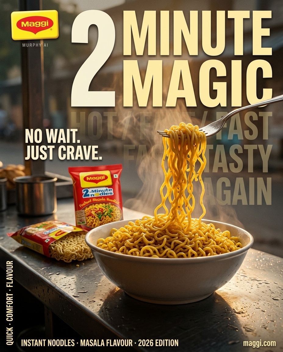
MAGGI® — “2 MINUTE MAGIC”
AGENCY-GRADE CINEMATIC FMCG BILLBOARD CAMPAIGN
FORMAT: Premium FMCG Key Visual / Outdoor Advertising Billboard
ASPECT RATIO: 4:5 Portrait
RESOLUTION: Ultra-high-resolution 8K, print-ready detail
VISUAL STYLE: Hyper-realistic commercial food photography, premium Indian FMCG advertising, large-format editorial art direction
CAMERA: ARRI Alexa Mini LF visual character, 35mm anamorphic perspective, controlled low-angle composition
ART DIRECTION: Murphy AI
CORE CREATIVE IDEA:
Transform an ordinary bowl of Maggi into an irresistible moment of instant gratification. The visual should communicate speed, warmth, familiarity, and intense food craving in a single frame. The noodles are the hero; the typography becomes a monumental graphic element integrated into the photographic environment. The final result must feel like a professionally art-directed global billboard campaign, not a generic AI-generated food poster.
01 — HERO SCENE & ENVIRONMENT
A cinematic Indian roadside chai-and-snack stall at first light, captured immediately after a light drizzle. The setting feels authentic, atmospheric, and unexpectedly premium. A dark, rain-dampened stainless-steel counter occupies the foreground, reflecting the warm amber glow of the rising sun.
At the exact center of the composition sits a generous ceramic bowl filled with freshly prepared Maggi Masala noodles. The noodles retain their unmistakable thin, curly structure, coated in a rich golden-yellow masala sheen with subtle orange seasoning, delicate oil highlights, and realistic moisture.
A stainless-steel fork enters from the upper-right quadrant, lifting a substantial bundle of noodles in a dramatic upward arc. Individual strands separate naturally, forming intricate overlapping curves with physically believable weight, tension, and gravity. Some strands remain connected to the bowl, creating a continuous visual path that directs the eye from the food toward the headline.
Thick, freshly released steam rises from the bowl in distinct translucent layers. Warm sunlight penetrates the vapor, creating luminous golden edges and subtle volumetric depth without obscuring the food.
A few microscopic droplets of masala-coated moisture catch the backlight near the lifted noodles. Keep the action restrained and appetizing; no exaggerated splashes or artificial floating ingredients.
02 — PRODUCT HERO & PACKAGING ACCURACY
Position one upright, sealed Maggi Masala Noodles packet behind the bowl, slightly left of center. Place a second, partially opened packet beside it, with the uncooked noodle cake visibly emerging from its original packaging.
The packaging must remain physically plausible, with realistic plastic-film reflections, natural folds, accurate packet proportions, and legible branding.
Use authentic Maggi packaging references wherever supplied. Preserve the original red-and-yellow brand identity, logo proportions, product naming, and packaging artwork. Do not invent additional product claims, redesign the logo, or generate counterfeit-looking package text.
The bowl remains the largest physical object in the foreground. The packets provide immediate brand recognition without competing with the noodles.
Any distant stall objects must be secondary, softly defocused, and free of distracting signage.
03 — COMPOSITION & VISUAL HIERARCHY
Build the frame using a carefully controlled three-plane composition.
FOREGROUND:
The reflective counter, the bowl, individual noodle strands, and subtle moisture details. Razor-sharp food texture with premium commercial styling.
MIDGROUND:
The Maggi packaging, fork, and ascending noodle movement. The fork and noodle strands form the principal diagonal leading line.
BACKGROUND:
A quiet, early-morning Indian street with shuttered storefronts, indistinct architectural silhouettes, distant atmospheric haze, and restrained practical lights.
Use a low camera position close to counter height. Keep the bowl visually substantial and the lifted noodles silhouetted against a brighter area of steam and sunrise.
Reserve a clean, dark-to-warm gradient in the upper-middle and right portions of the frame for the primary headline. Typography must remain readable at billboard viewing distance.
The composition should feel bold and asymmetrical, with deliberate negative space rather than excessive decorative elements.
04 — PRIMARY BILLBOARD TYPOGRAPHY
MAIN HEADLINE:
“2 MINUTE
MAGIC”
Set in monumental, ultra-bold condensed sans-serif typography with custom optical spacing, tight kerning, and precise alignment.
The headline occupies the central upper half of the poster, extending across the composition without covering the bowl or the critical noodle silhouette.
Use warm ivory or pale butter-yellow lettering with selective deep-red accents. Introduce subtle dimensional separation through controlled shadowing and atmospheric integration, never through excessive bevels, extrusion, or artificial 3D effects.
The numeral “2” should be the dominant typographic anchor. “MINUTE” creates a strong horizontal block, while “MAGIC” delivers the final visual impact.
The typography should feel engineered for a high-visibility Times Square-scale advertising installation: immediate comprehension, powerful contrast, and unmistakable hierarchy.
05 — SECONDARY TYPOGRAPHIC SYSTEM
BACKGROUND TYPOGRAPHY:
“HOT / FAST / TASTY / AGAIN”
Repeat this phrase as oversized, low-opacity typographic layers receding into the background. Use progressively reduced contrast and carefully controlled perspective to create depth.
The words must sit behind the physical subject, with portions naturally disappearing into the atmospheric haze. Maintain sufficient separation from the main headline.
MID-LEFT SUPPORTING COPY:
“NO WAIT.
JUST CRAVE.”
Set in bold condensed uppercase lettering, smaller than the headline but strong enough to read at a glance. Position it within a controlled dark region to preserve legibility.
BOTTOM-LEFT PRODUCT DESCRIPTOR:
“INSTANT NOODLES · MASALA FLAVOUR · 2026 EDITION”
Use a clean, compact grotesk sans-serif with generous tracking, precise baseline alignment, and restrained visual weight.
BOTTOM-RIGHT:
“http://maggi.com”
Set in small, clean, high-contrast typography with comfortable spacing from the frame edges.
LEFT VERTICAL EDGE:
“QUICK · COMFORT · FLAVOUR”
Run vertically along the left margin as a narrow editorial detail. Maintain consistent letter spacing and a clear safe margin.
BRAND SIGNATURE — TOP LEFT:
Authentic Maggi logo, reproduced faithfully from the supplied reference.
Directly beneath the logo, place:
“MURPHY AI”
Use small, thin, understated uppercase typography with generous tracking. Treat it as a discreet creative studio signature rather than a competing brand element.
06 — LIGHTING & FOOD PHOTOGRAPHY
PRIMARY LIGHT:
Warm sunrise backlight entering from the rear-left, producing a golden halo around the steam and delicate highlights across the lifted noodles.
FILL:
Soft, neutral frontal fill sufficient to reveal the individual noodle strands, masala coating, and bowl rim without flattening the shadows.
EDGE LIGHT:
A narrow, naturally motivated highlight along the fork, selected noodle strands, and upper edge of the packaging.
SURFACE LIGHT:
Long, broken reflections across the wet stainless-steel counter, with realistic changes in brightness and texture.
SHADOWS:
Deep, controlled blacks in the background and underneath the bowl. Preserve detail in the dark areas.
The image should exhibit the tonal richness of a premium food commercial, with bright appetizing highlights, dimensional shadows, and restrained HDR. Avoid oversaturation, excessive orange color grading, and artificial glow.
07 — COLOR SCIENCE & MATERIAL DETAIL
CORE PALETTE:
• Signature Maggi red
• Saturated brand yellow
• Golden-orange sunrise
• Warm ivory typography
• Deep charcoal-black shadows
• Neutral stainless-steel reflections
FOOD TEXTURE:
Individual noodle ridges must remain distinct. Show realistic masala adherence, delicate moisture, tiny oil highlights, and natural variations in strand thickness.
STEAM:
Translucent, volumetric, and irregular. It must behave like real hot food vapor, not smoke from a fire or digitally generated ribbons.
PACKAGING:
Realistic printed plastic film with accurate specular highlights and subtle surface creasing.
COUNTER:
Wet brushed stainless steel with directional grain, tiny water droplets, and broken reflections.
All materials must respond consistently to the same light sources.
08 — CAMERA & IMAGE CHARACTER
Camera reference: ARRI Alexa Mini LF.
Lens character: 35mm anamorphic-inspired perspective.
Focus: Precise on the lifted noodles and bowl, with the packaging remaining sufficiently legible.
Depth of field: Shallow but commercially controlled.
Exposure: Protect the bright steam and packaging highlights while retaining rich shadow detail.
Motion impression: Freeze the noodles at the most visually compelling instant, preserving strand separation and believable physical structure.
Image finish: Natural microcontrast, realistic optical falloff, fine photographic texture, premium commercial color grading.
The final image must resemble a real food campaign shot by a specialist commercial photography team, with typography and graphic design added through a disciplined professional art-direction process.
09 — FINAL ART DIRECTION
The finished billboard must communicate three things within the first second:
1. The unmistakable craving appeal of freshly cooked Maggi.
2. The immediate promise of speed through “2 MINUTE MAGIC.”
3. The warmth and comfort of an everyday food moment transformed into a premium advertising image.
Maintain a clear distinction between photography, product packaging, and typography while ensuring that all three operate as one cohesive visual system.
The atmosphere may be cinematic, but the food must remain believable. The design may be monumental, but the layout must remain disciplined.
No unnecessary props. No cluttered street scene. No random floating spice particles. No excessive steam obscuring the product. No distorted noodles. No warped fork. No duplicate packaging. No malformed lettering. No illegible logo. No plastic-looking food. No synthetic CGI aesthetic. No arbitrary typography floating across the frame.
FINAL OUTPUT:
A striking 4:5 portrait Maggi billboard key visual with authentic brand presence, extraordinary food texture, dramatic sunrise lighting, monumental editorial typography, premium FMCG art direction, and a subtle Murphy AI signature.
The image should feel ready for a major outdoor advertising campaign: visually immediate, commercially polished, appetizing at first glance, and memorable from a distance.