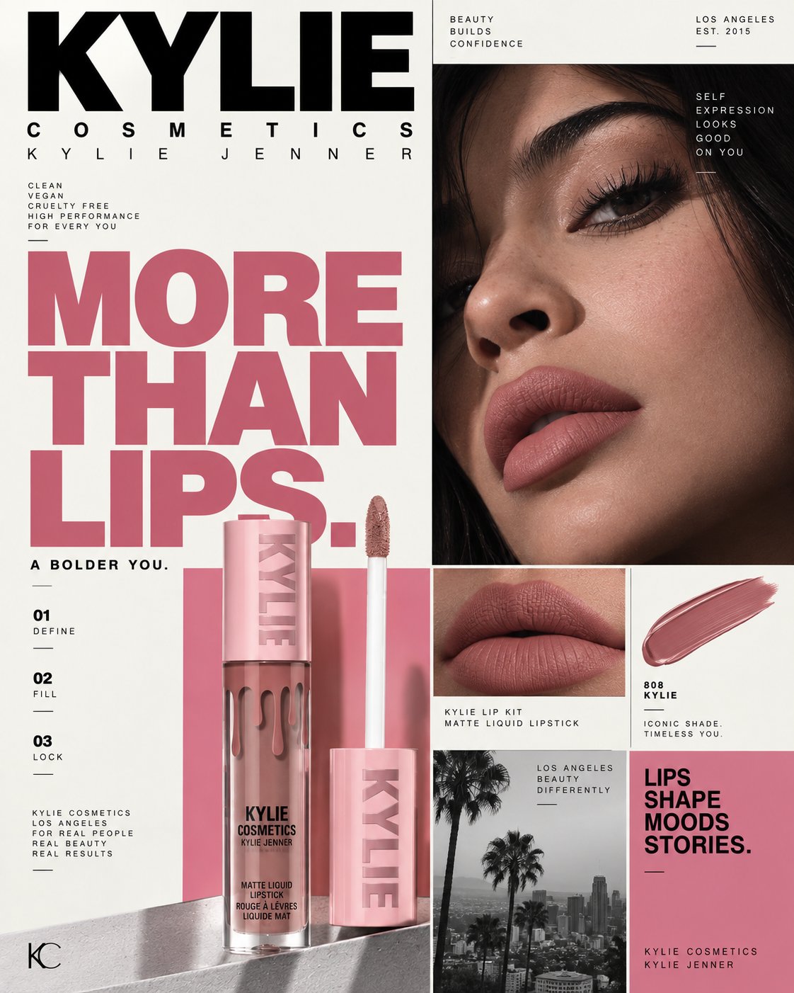
Swiss Style Maybelline Beauty Campaign Prompt
This prompt guides you in creating a premium advertising poster for Maybelline New York, fully embracing the Swiss International Typographic Style. It emphasizes a disciplined approach to graphic design, focusing on a single concept: 'LASHES CHANGE EVERYTHING.' You'll construct the composition using a strict modular grid, ensuring every element aligns perfectly while maintaining a visually intelligent aesthetic. From the powerful close-up of a human eye to the meticulous art direction of the Lash Sensational Sky High Mascara, this prompt challenges you to create a striking piece that feels both contemporary and timeless. Perfect for graphic designers looking to push the boundaries of beauty advertising, this prompt is your key to crafting a campaign-grade visual that stands out in social media feeds.
MAYBELLINE NEW YORK. Act as a Senior Graphic Designer, Swiss International Typographic Style Art Director, Beauty Campaign Creative Director, and Contemporary Editorial Art Director specializing in high-end cosmetics advertising, rigorous grid systems, art-directed product photography, experimental typography, monochrome beauty imagery, and social-first campaign design.
Create a premium Maybelline New York social media advertising poster in authentic Swiss International Typographic Style.
This must NOT look like a generic cosmetics advertisement with a Swiss filter applied.
The design should feel like a real art director deliberately translated a Maybelline beauty campaign into a strict Swiss graphic system: rational, geometric, editorial, highly controlled, asymmetric, typographically powerful, and visually intelligent.
⸻
PHASE 1 — CREATIVE CONCEPT
Build the entire poster around ONE simple advertising idea:
“LASHES CHANGE EVERYTHING.”
The concept is that a single transformation of the eye changes the visual character of the entire composition.
The eye/lashes become the photographic focal point, while the product becomes the physical proof of that transformation.
Do not represent this with magical effects, floating lashes, CGI particles, or surreal cosmetic effects.
Instead, create the feeling through scale, cropping, contrast, typography, and before/after photographic relationships.
The viewer should understand immediately:
EYE → LASH TRANSFORMATION → PRODUCT → MAYBELLINE
One concept only.
No unnecessary decorative objects.
⸻
PHASE 2 — SWISS VISUAL SYSTEM
Use authentic principles of Swiss International Typographic Style.
Construct the entire poster on a clearly disciplined modular grid.
Use:
* Strong vertical columns
* Horizontal divisions
* Mathematical alignment
* Unequal but intentional image blocks
* Asymmetrical balance
* Large negative space
* Clear typographic hierarchy
* Flush-left typography
* Consistent margins
* Thin rules
* Numbered information modules
* Controlled repetition
* Precise spacing
* Functional graphic elements
The grid must visibly control the composition.
Do NOT create a generic magazine collage where objects are randomly placed.
Every element must align to the underlying grid.
The composition should feel almost architectural.
⸻
PHASE 3 — COLOR SYSTEM
Use a strict Swiss-inspired palette:
OFF-WHITE / PAPER — primary background
BLACK — dominant typography and photography
MAYBELLINE PINK / MAGENTA — single accent color
METALLIC ROSE-PINK — only where naturally present on the product
Keep the background warm off-white rather than pure white.
Use the pink accent strategically:
* Main headline
* One structural grid block
* Product information area
* Small accent details
Do NOT use:
* Gradients
* Neon glow
* Purple
* Gold
* Glitter
* Lens flares
* Decorative color effects
* Multiple accent colors
The product itself should provide the visual richness.
⸻
PHASE 4 — HERO PHOTOGRAPHY
Create one extreme editorial close-up of a real human eye.
The eye should dominate one large rectangular grid module.
Crop aggressively:
* eyebrow partially visible
* eyelid visible
* lashes extremely sharp
* portion of cheek
* partial nose bridge
* face extending outside the photographic frame
The eye should feel like a high-fashion beauty photograph, not a stock beauty image.
Natural skin texture must remain visible:
* pores
* fine facial hairs
* subtle skin variation
* realistic eyelid texture
* natural eyelashes
* believable moisture
* realistic catchlight
No plastic skin.
No AI-perfect face.
No excessive retouching.
The lashes should be dramatic but physically believable.
The image should be primarily black and white, allowing the Maybelline pink to become the only major chromatic accent.
⸻
PHASE 5 — PRODUCT ART DIRECTION
Use Maybelline New York Lash Sensational Sky High Mascara as the hero product.
Treat the mascara as an actual commercially photographed object.
Preserve the real product’s:
* cylindrical silhouette
* proportions
* metallic pink/rose packaging
* black typography
* cap construction
* embossed/printed detailing
* applicator
* brush geometry
* material finish
* reflections
* seams
* physical dimensions
Show the mascara and wand as a controlled product photograph, not a floating CGI object.
Place the product inside a dedicated grid module.
The product may extend slightly beyond its module boundary, but it must still feel intentionally anchored to the grid.
Create believable:
* contact shadow
* material reflections
* metallic highlights
* edge definition
* photographic depth
* realistic scale
No warped packaging.
No invented product redesign.
No duplicated mascara.
No random cosmetic objects.
⸻
PHASE 6 — PRODUCT + GRID RELATIONSHIP
The product should occupy a strong lower-left or lower-central grid block.
Place the mascara vertically.
Allow the product to visually interact with the surrounding grid without destroying the grid.
Behind it, use a solid Maybelline pink rectangular field.
The pink block should function as a graphic architectural element rather than a decorative background.
The mascara should remain the most recognizable physical object in the product module.
Place the mascara wand beside it with precise spacing.
The composition should resemble a meticulously art-directed Swiss product study.
⸻
PHASE 7 — TYPOGRAPHIC ARCHITECTURE
The primary headline:
**LASHES
CHANGE
EVERYTHING.**
Set it in a bold Helvetica / Helvetica Neue-inspired grotesk sans-serif.
Extremely large.
Tight but controlled line spacing.
Flush-left.
Black or Maybelline pink depending on placement.
The headline should occupy approximately 35–40% of the visual frame.
Do not use:
* serif fonts
* script fonts
* handwritten lettering
* decorative fonts
* 3D typography
* warped typography
* excessive shadows
* gradient type
Typography must be perfectly clean and editorial.
Allow the headline to approach the edges of the frame while maintaining deliberate margins.
⸻
PHASE 8 — INFORMATION HIERARCHY
Introduce small Swiss-style informational modules.
Use restrained copy such as:
01
LASH IMPACT
Length
Volume
Lift
02
SKY HIGH
Lash Sensational
Mascara
03
THE BRUSH
Flexible brush
Reaches from root to tip
Keep these modules small.
Use uppercase typography with generous tracking.
Use thin horizontal rules between information groups.
The small text should function like technical editorial annotation, not advertising clutter.
⸻
PHASE 9 — BEFORE / AFTER
Create a small photographic comparison module.
Two tightly cropped eye images:
BEFORE
and
AFTER
The “AFTER” eye should show visibly more defined, lifted, lengthened lashes.
Keep both photographs monochrome.
Do not make the transformation absurd.
The difference should look like professional mascara application.
The module must align perfectly with the grid.
⸻
PHASE 10 — MAYBELLINE BRANDING
Place:
MAYBELLINE NEW YORK
prominently at the top.
Use the authentic Maybelline wordmark appearance:
* bold uppercase
* black
* wide horizontal presence
* clean geometric construction
Keep branding restrained.
Do not turn the poster into a giant logo showcase.
Include:
MAKE IT HAPPEN
as a small supporting brand line.
Place it within the grid as a secondary information element.
⸻
PHASE 11 — NEW YORK VISUAL LANGUAGE
Introduce ONE restrained monochrome architectural photograph of New York City.
Use an urban detail such as:
* Manhattan skyline
* Empire State Building
* New York street architecture
Treat it as a small photographic grid module, not a cinematic background.
It should reinforce the Maybelline New York identity.
Keep it black and white.
Do not make it tourist-poster-like.
Do not use Times Square neon.
Do not use giant skyline panoramas.
It should feel like an editorial archival image inside a Swiss design system.
⸻
PHASE 12 — COMPOSITION
4:5 vertical Instagram poster.
Build the composition approximately as:
TOP
Large MAYBELLINE NEW YORK wordmark spanning the upper grid.
LEFT / CENTER
Massive:
LASHES
CHANGE
EVERYTHING.
RIGHT
Large monochrome extreme eye photograph.
LOWER LEFT
Maybelline pink block containing the physical Sky High mascara and wand.
LOWER CENTER / RIGHT
Small product-information modules.
LOWER RIGHT
Small monochrome New York architectural photograph + eye detail.
EDGES
Tiny technical typography, numbering, rules, and metadata.
Maintain generous off-white negative space.
The overall composition must feel asymmetrical but mathematically balanced.
⸻
PHASE 13 — PHOTOGRAPHIC QUALITY
Everything must look physically photographed.
Use:
85mm / 100mm beauty lens aesthetic
with:
* precise optical sharpness
* shallow but believable depth of field
* controlled studio lighting
* soft directional shadows
* realistic metallic reflections
* subtle film grain
* natural tonal roll-off
* high micro-detail
* professional commercial retouching
Avoid exaggerated cinematic color grading.
Avoid artificial HDR.
Avoid fake depth effects.
Avoid excessive bokeh.
The result should look like a real campaign photographed and then designed by a Swiss graphic designer.
⸻
PHASE 14 — ANTI-AI-SLOP CONTROL
Absolutely NO:
* floating mascara
* random makeup objects
* roses
* flowers
* glitter
* particles
* liquid splashes
* neon
* CGI eyelashes
* surreal floating eyes
* fake reflections
* excessive pink
* gradients
* luxury gold
* decorative borders
* fashion-script typography
* fake handwritten text
* random icons
* excessive badges
* unnecessary copy
* generic beauty poses
* plastic skin
* distorted hands
* malformed mascara packaging
* duplicated products
* warped logos
* gibberish typography
* random architectural elements
* cinematic lens flares
* excessive shadows
* generic “AI luxury” aesthetics
Every element must have a clear advertising or graphic-design purpose.
⸻
FINAL ART-DIRECTION TARGET
The finished image should feel like:
Swiss International Typographic Style × Maybelline New York × contemporary beauty photography × New York editorial culture.
It should resemble a museum-quality graphic design poster that also functions as a premium commercial advertisement.
The visual hierarchy must be immediately readable:
1. MAYBELLINE
2. EYE / LASH TRANSFORMATION
3. “LASHES CHANGE EVERYTHING.”
4. SKY HIGH MASCARA
5. SUPPORTING INFORMATION
The poster must remain visually powerful even if every piece of typography is removed.
At Instagram thumbnail size, the viewer should immediately see:
A giant eye.
A strong graphic grid.
A pink product block.
A recognizable mascara.
No visual noise.
No generic cosmetics aesthetic.
Strict Swiss structure.
Contemporary beauty photography.
Exceptional typography.
One concept.
One hero product.
One disciplined color system.
4:5 vertical.
Campaign-grade execution